Status: Design & Tech Development
The Background
Accountly is an innovative accounting software designed aiming towards small businesses, freelancers and contractors. Their end goal is to create an app that offers tools for income and expense tracking, tax management, and financial insights. They have a skeleton and idea of a mobile app, but needed help with simplifying the complexities of bookkeeping and accounting through an intuitive user interface.
The Brief
I was tasked with designing the first stage app focused on the core functionalities of recording income and expenses for now.
Team
1 UI/UX Designer, 1 Software Developer
Tools
Figma

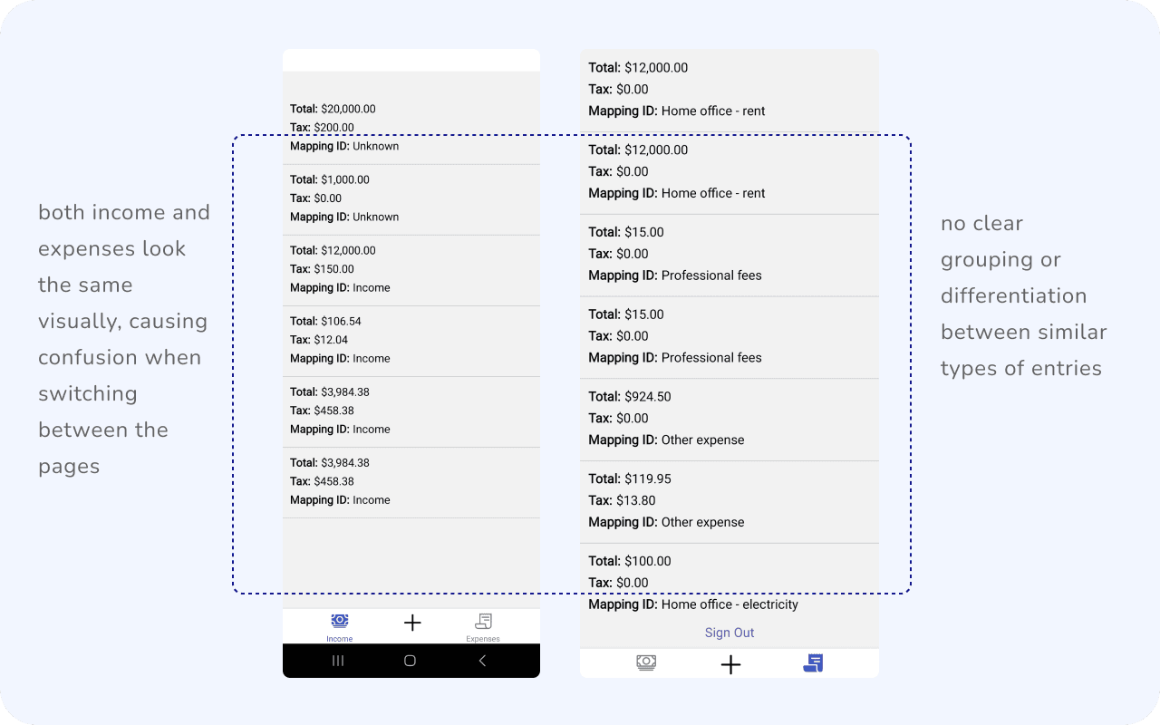
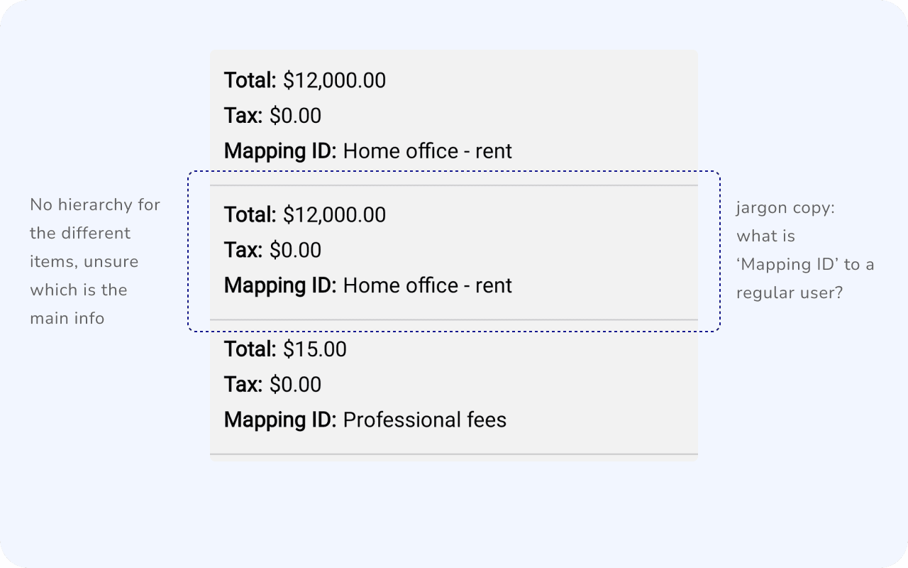
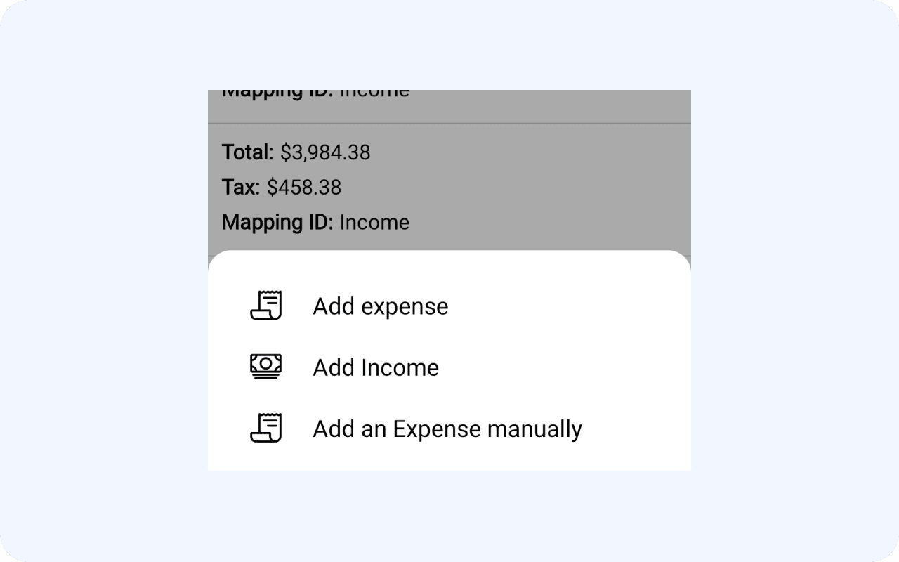
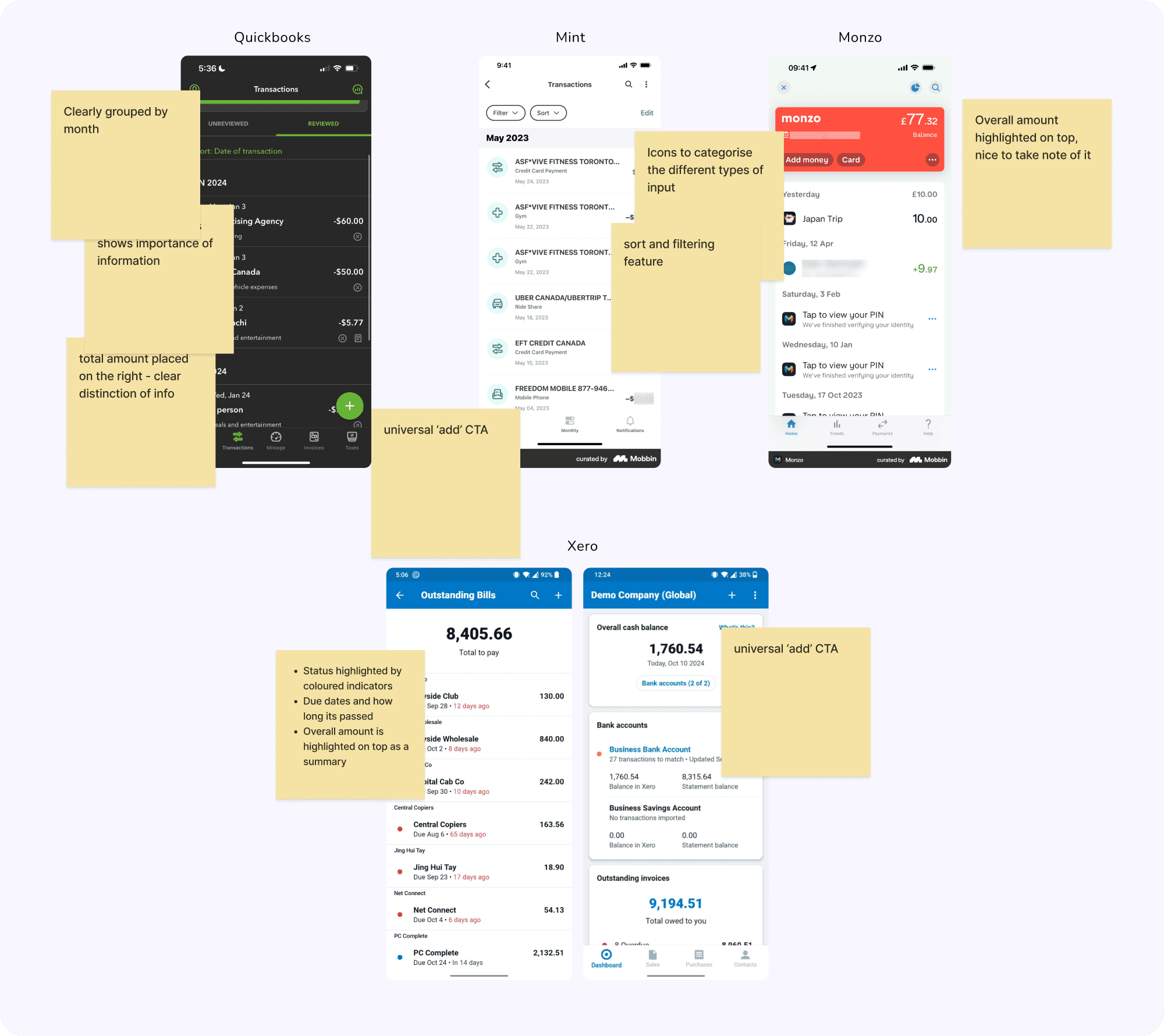
Looking through the skeleton to get an idea of the app core functions, and how I could improve on them:
I started looking into other similar apps:
Simplified User Interface
Streamline the design to reduce visual clutter and make it easier for users to find the information they need at a glance.
Enhanced Visual Hierarchy
Redesign the layout to prioritise key financial data, such as total balance, individual transaction details, and status
Modernized
Aesthetic
Update the overall design to align with modern mobile app design trends, ensuring it feels more user-friendly and visually appealing.
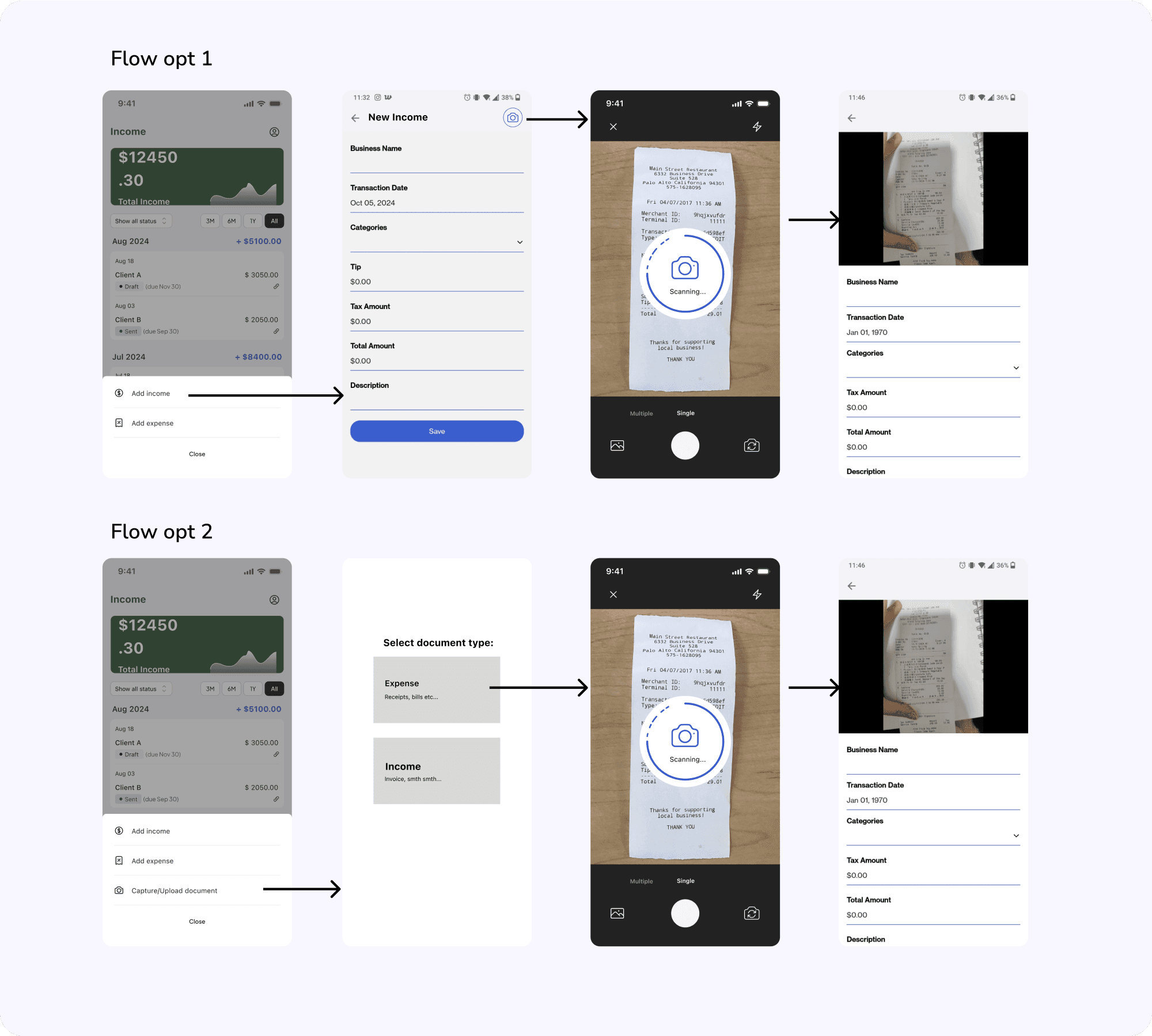
I created wireframes/mockups to explore different layout and information display options, with reviews in between between me and the client:
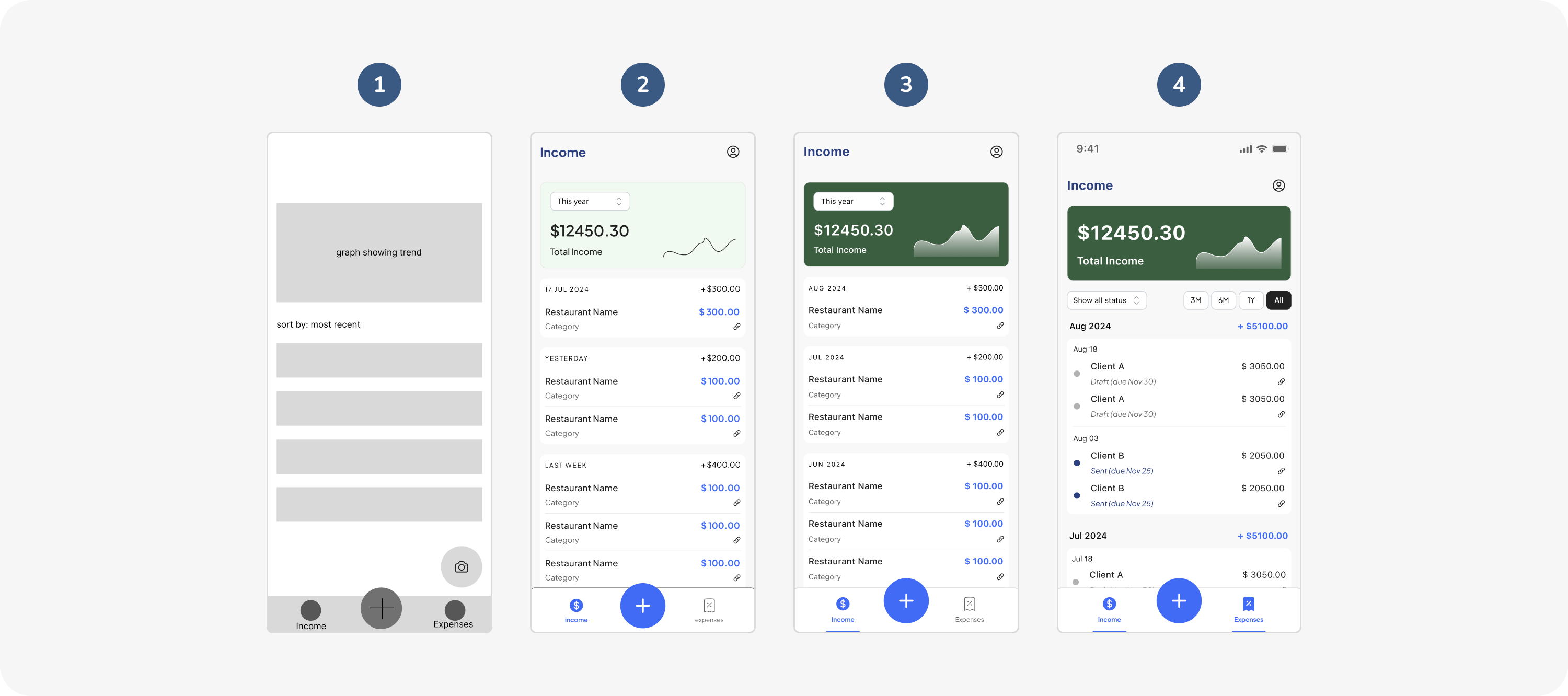
1
2
3
4
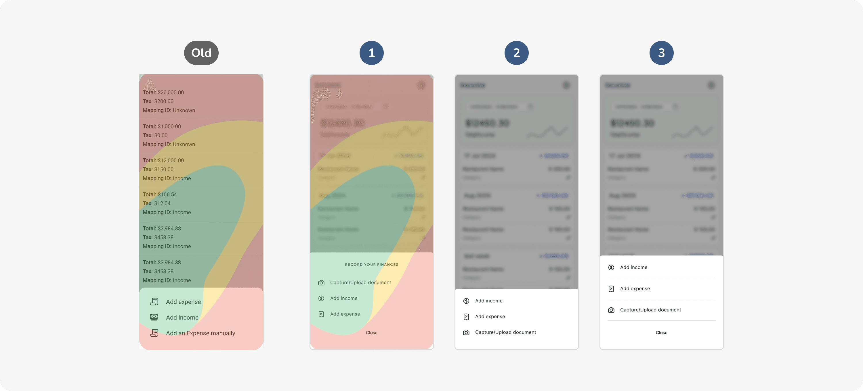
1
2
3
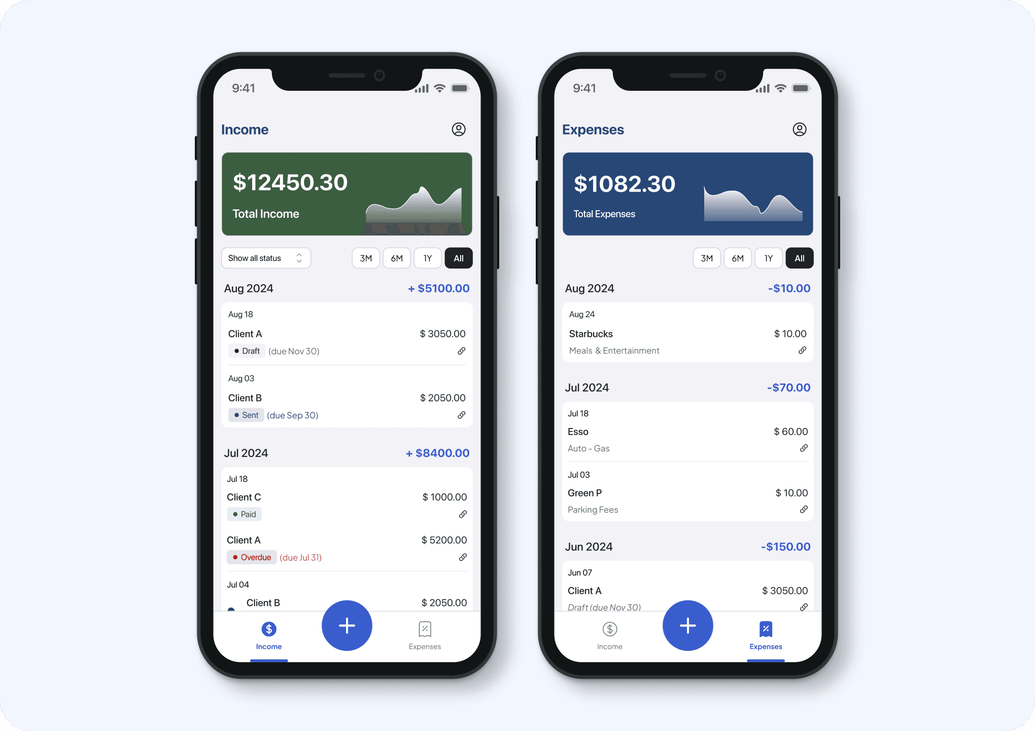
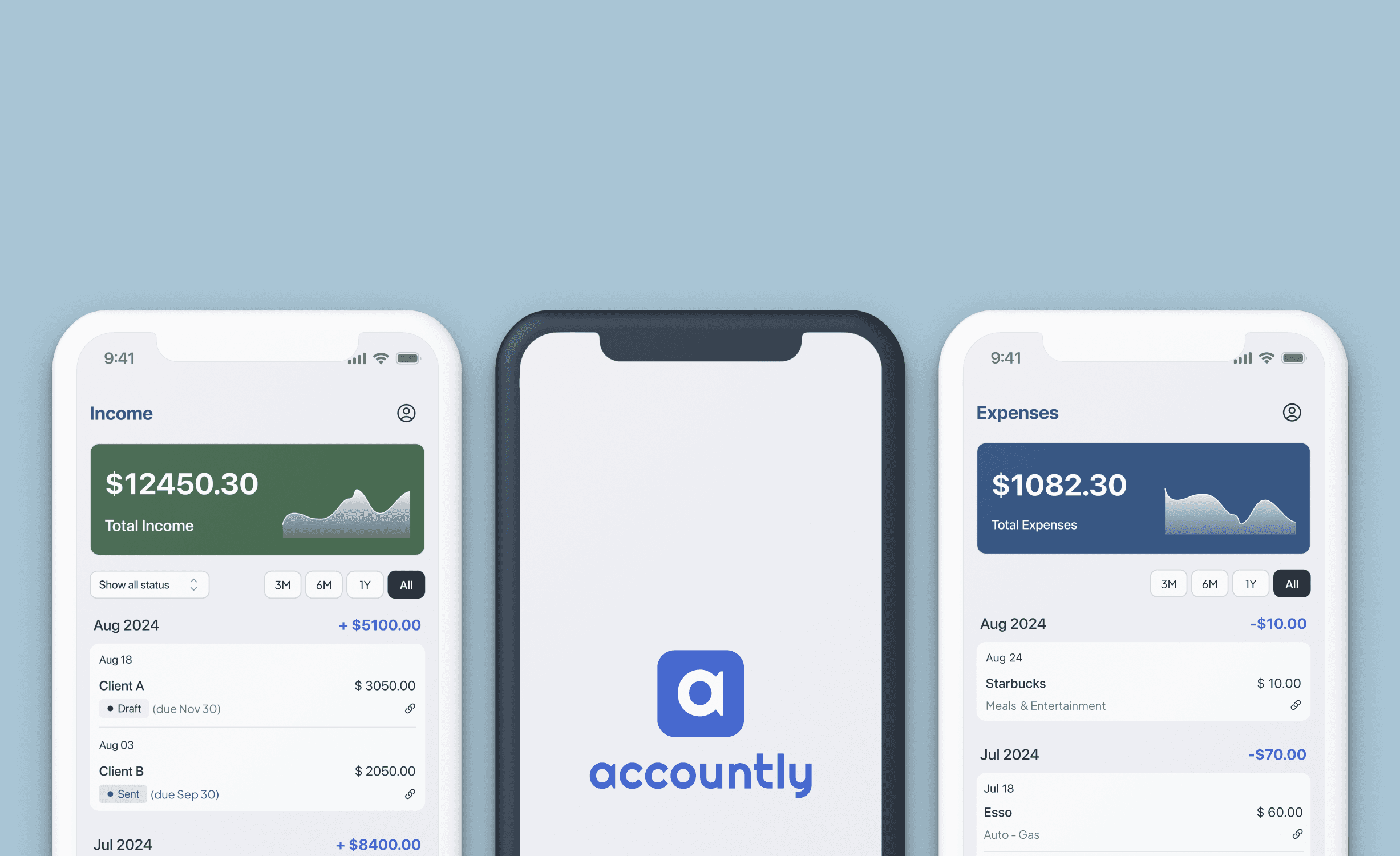
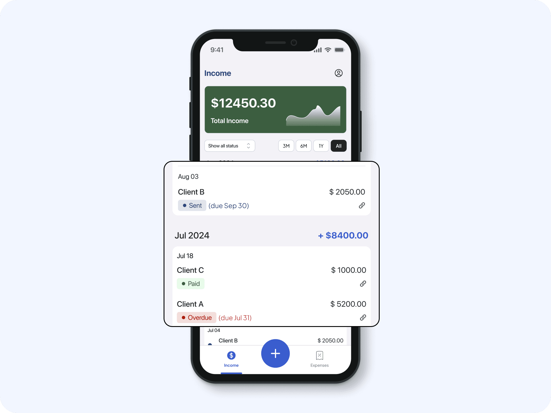
Categorised, and Clear
The addition of the summary and clear title on top gives and immediate visual cue as to which pages users are currently.
Visual Indicators
In addition to grouping by month, status indicators differentiated by colours gives an instant visual cues for users, and could quickly scan through the different repetitive information.
more works