ASP Medical Group, web
ASP Medical Group, web
Redesigning a story and brand that builds trust
Redesigning a story and brand that builds trust
Landing Page Redesign
Landing Page Redesign
Status: Launched

The Context
ASP Medical Group is a healthcare Third Party Administrator (TPA) and Managed Care Organization (MCO) in Malaysia specialising in claims administration, medical second opinions, and healthcare management. The client prioritises trust and innovation as part of the values, and would like to redesign their landing page to reflect that.
ASP Medical Group is a healthcare Third Party Administrator (TPA) and Managed Care Organization (MCO) in Malaysia specialising in claims administration, medical second opinions, and healthcare management. The client prioritises trust and innovation as part of the values, and would like to redesign their landing page to reflect that.
The Brief
To redesign the landing page with a modern direction, building a more comprehensive story and better general user experience.
To redesign the landing page with a modern direction, building a more comprehensive story and better general user experience.
Team
2 UI/UX Designers, 1 Web Developer
2 UI/UX Designers, 1 Web Developer
Tools
Figma, Figjam
Figma, Figjam
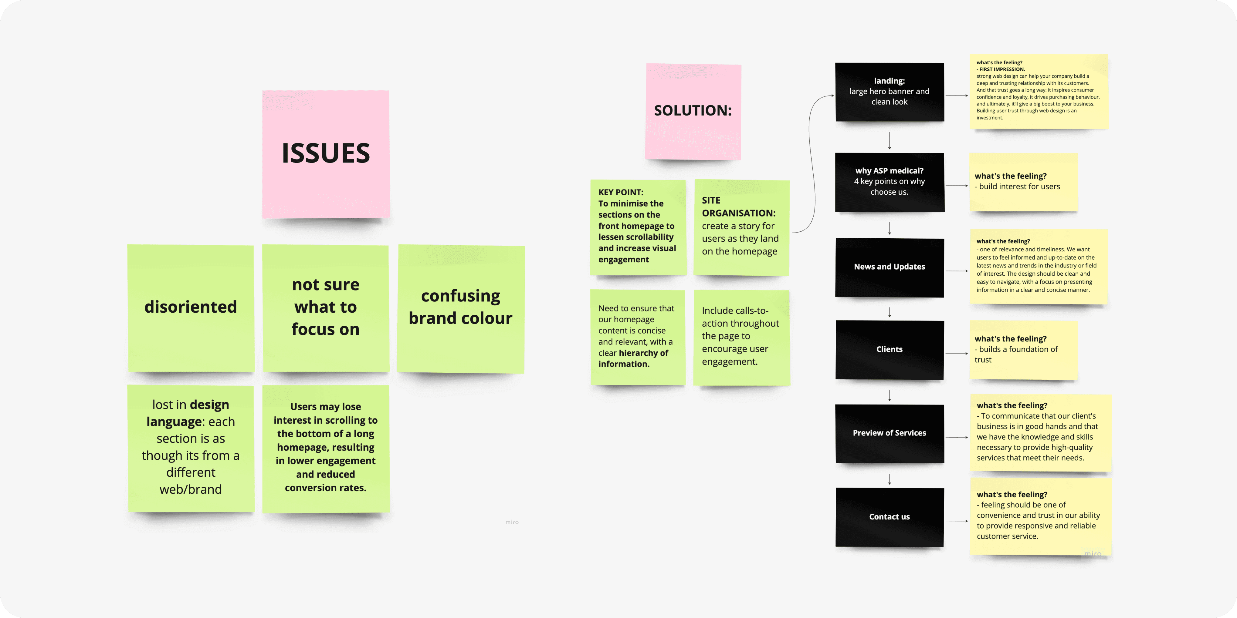
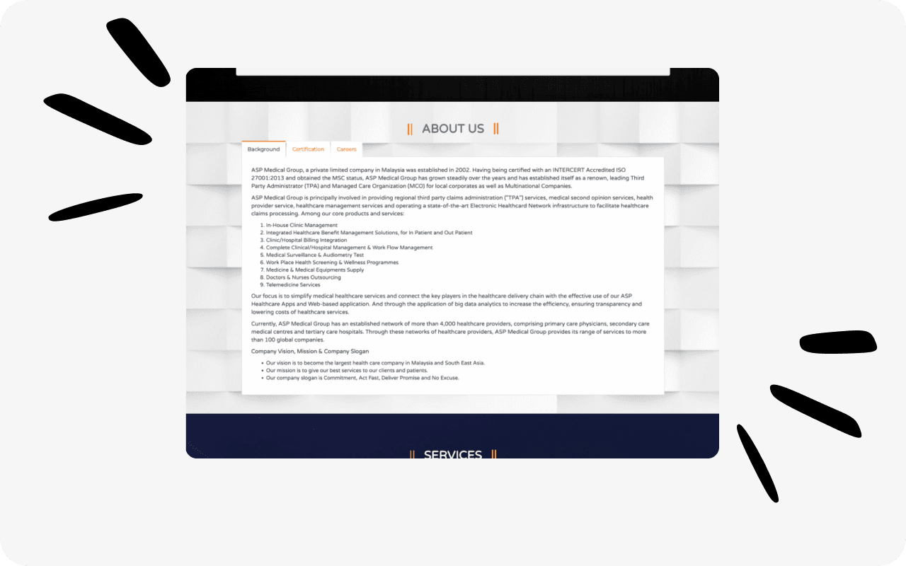
The Problem
The Problem
The main challenge was that users often felt confused when landing on the platform, frequently abandoning the homepage due to unclear guidance on what actions to take next.
The main challenge was that users often felt confused when landing on the platform, frequently abandoning the homepage due to unclear guidance on what actions to take next.

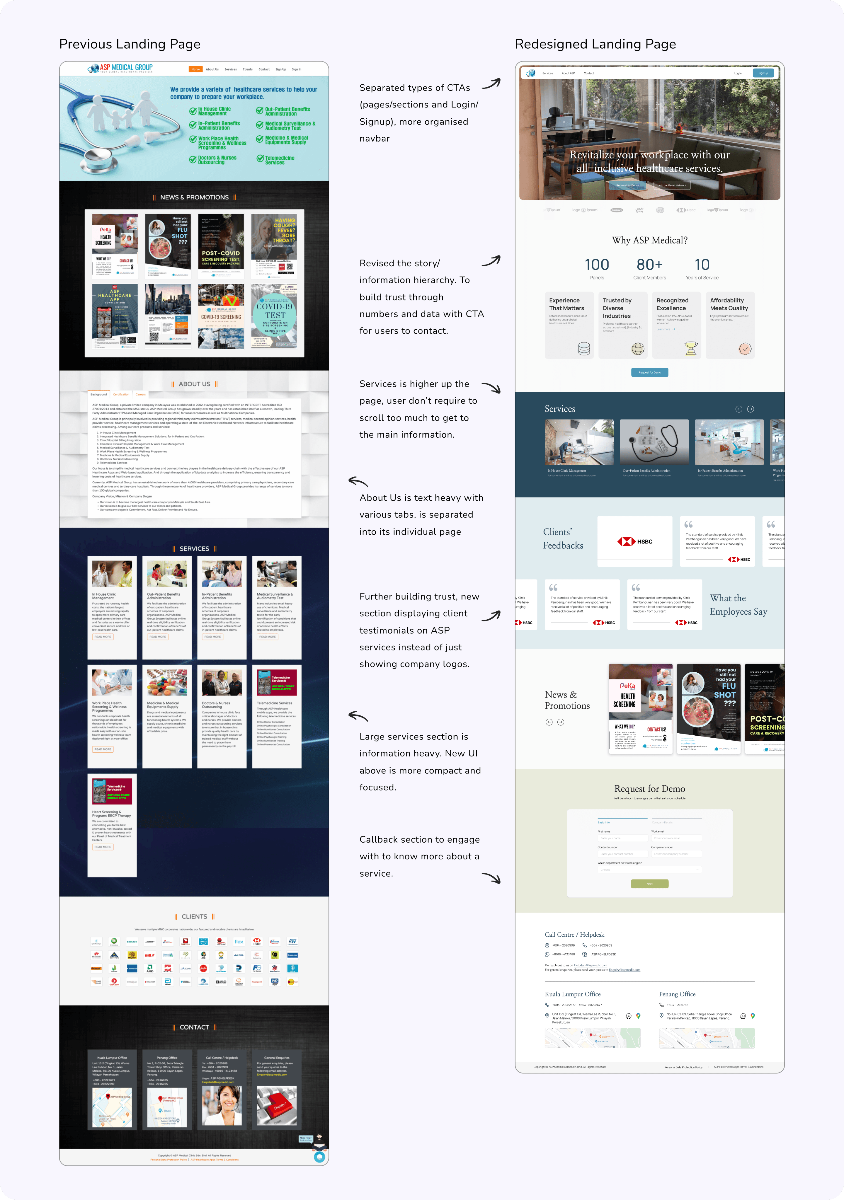
Sneak peak of the final designs!
Sneak peak of the final designs!
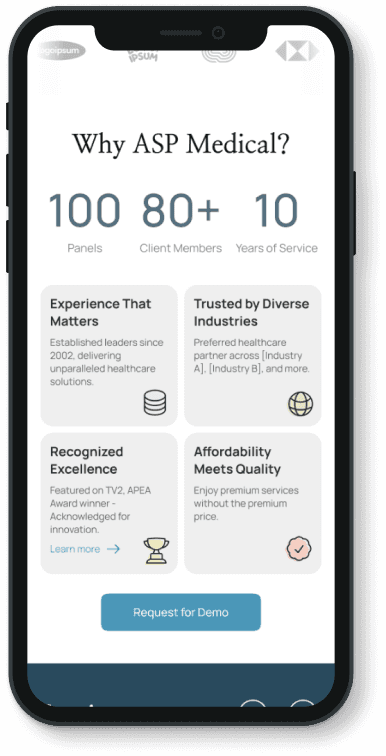
Build trust through numbers and data
Build trust through numbers and data
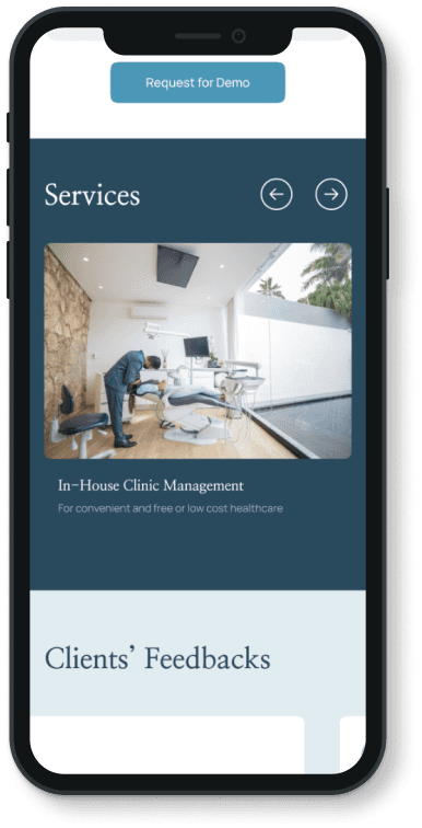
Comprehensive and focused "Services" section
Comprehensive and focused "Services" section
Clear CTA and digestible information
Clear CTA and digestible information
The Process
The Process
Discover
Discover
I hosted a auditing session where we went through the old landing page with the main goal of a user in mind:
I hosted a auditing session where we went through the old landing page with the main goal of a user in mind:
To find and know more about the relevant services suited for my business and employees.
To find and know more about the relevant services suited for my business and employees.
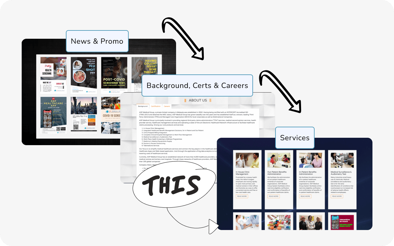
We then laid everything out on Miro and extracted the potential pain points to specific sections that users go through, and then brainstormed ideas on how to solve them.
We then laid everything out on Miro and extracted the potential pain points to specific sections that users go through, and then brainstormed ideas on how to solve them.
Part of the documentation to present our findings to ASP Medical:
Part of the documentation to present our findings to ASP Medical:
Wireframe showcasing the story flow of the landing page, and highlighting the intention and reason behind the restructure.
Wireframe showcasing the story flow of the landing page, and highlighting the intention and reason behind the restructure.
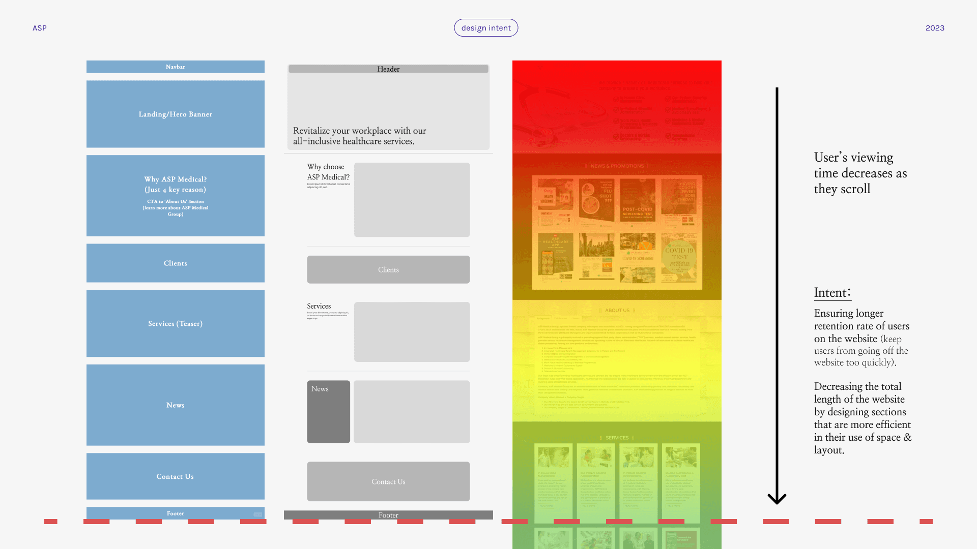
Proposed colours and typography for the website. Blue was chosen as it gives a more clean and professional impression, as well as the Serif font as headers.
Proposed colours and typography for the website. Blue was chosen as it gives a more clean and professional impression, as well as the Serif font as headers.
Key Insights
Key Insights
Potential improvements to be made:
Overload of Information
Users experience difficulty quickly identifying key services or navigating the site due to the dense amount of text and images on the homepage.
Users experience difficulty quickly identifying key services or navigating the site due to the dense amount of text and images on the homepage.
Service Visibility and Navigation
Confusing hierarchy and navigation.
Confusing hierarchy and navigation.
User Interaction and Call to Action
Lacks strong, clear calls to action (CTA), making it difficult for users to understand the next steps to engage the company's services.
Lacks strong, clear calls to action (CTA), making it difficult for users to understand the next steps to engage the company's services.
Brand Messaging and User Focus
Messaging more focused on the company's certifications and achievements rather than directly addressing user needs or pain points, which could affect user connection and trust.
Messaging more focused on the company's certifications and achievements rather than directly addressing user needs or pain points, which could affect user connection and trust.
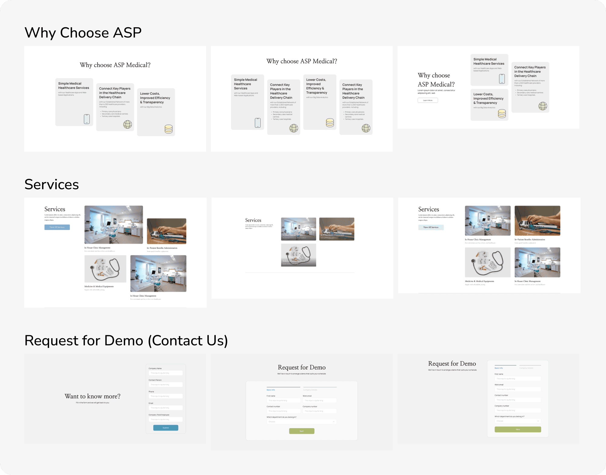
Iterations Upon Iterations
Iterations Upon Iterations
We then played around different iterations for the sections, before handing them over to the client where the designs were also shared with the users for feedback.
We then played around different iterations for the sections, before handing them over to the client where the designs were also shared with the users for feedback.
Design Solutions
Design Solutions
Overall Landing Page Redesign Highlights:
Overall Landing Page Redesign Highlights:
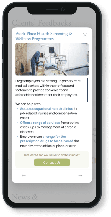
“Services” Overlay Redesign
“Services” Overlay Redesign:
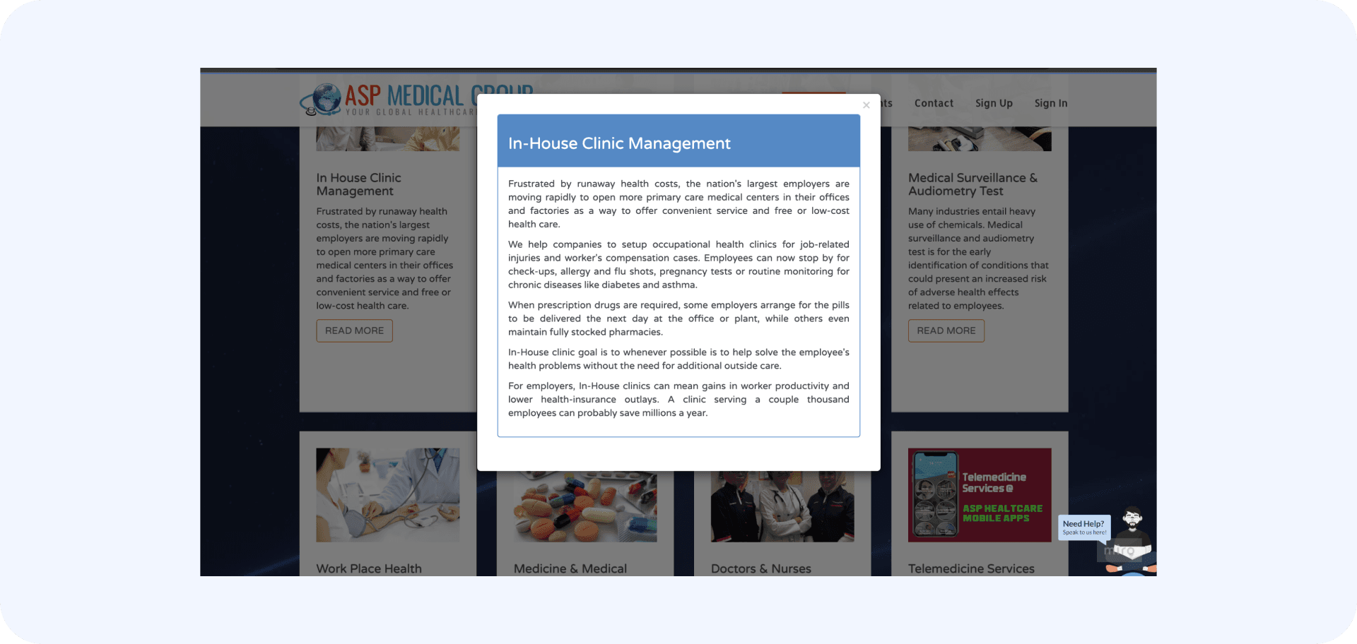
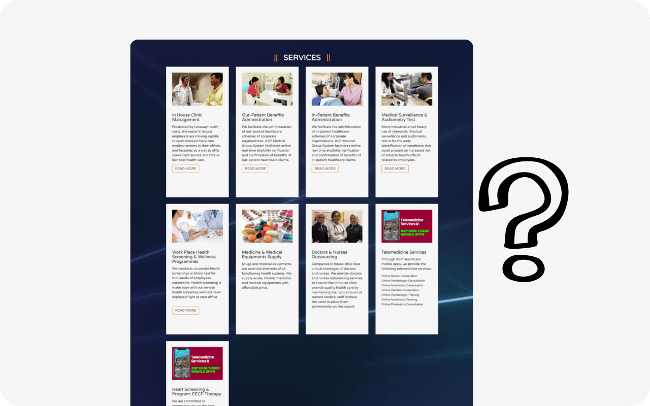
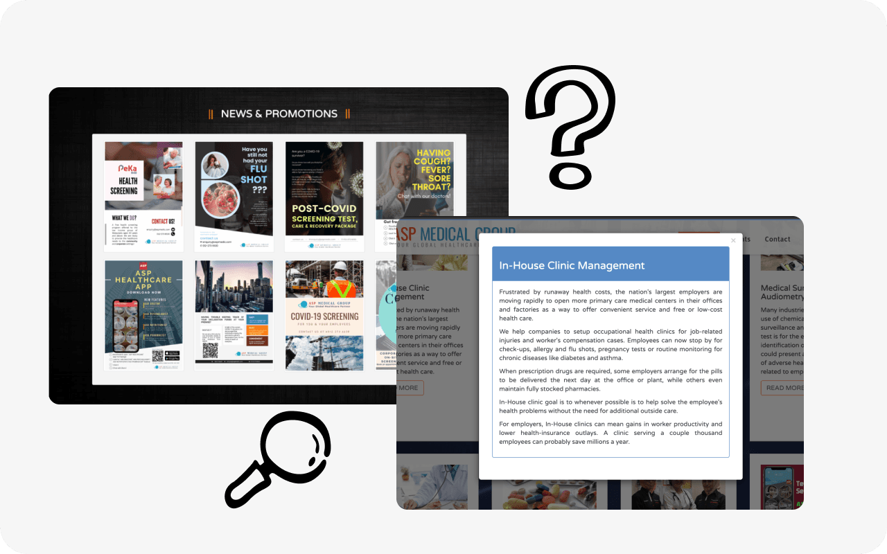
Problem
Problem
The overlay contains only paragraphed text, and information heavy. Users are unclear on where to proceed after this.
The overlay contains only paragraphed text, and information heavy. Users are unclear on where to proceed after this.
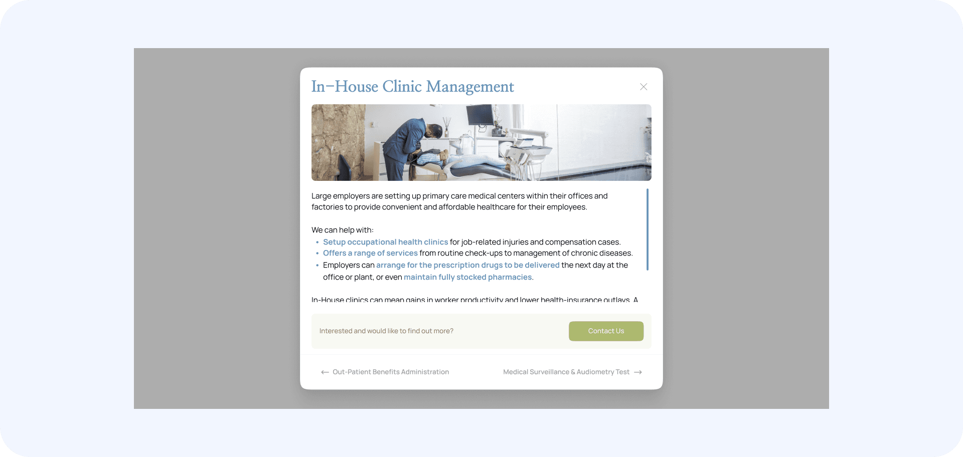
Solution
Solution
The information in the overlay is now more broken down and easy to focus with bullet points and a visual image to capture attention. Users can also easily navigate between services and contact customer service regarding this specific service quickly.
The information in the overlay is now more broken down and easy to focus with bullet points and a visual image to capture attention. Users can also easily navigate between services and contact customer service regarding this specific service quickly.
Interactive Contact Form:
Interactive Contact Form:
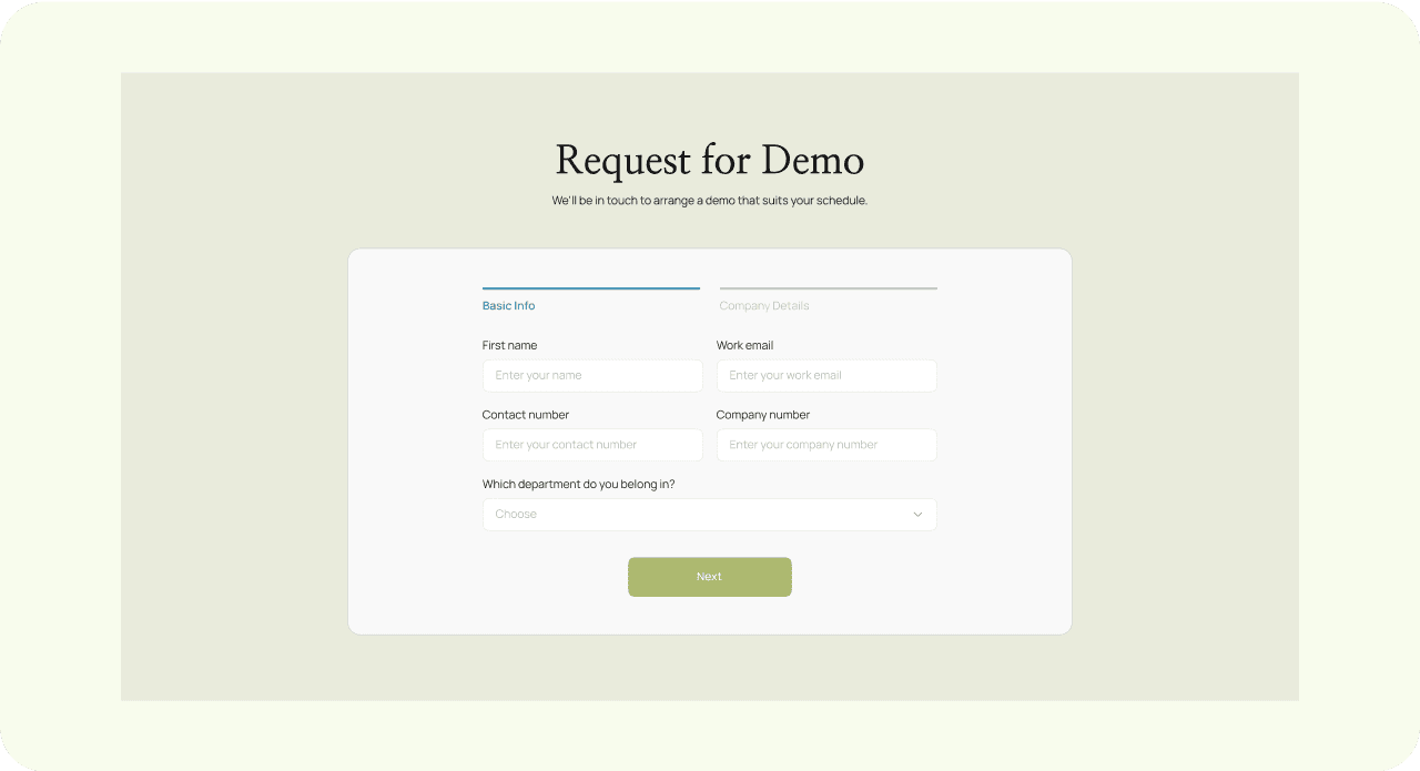
The redesigned "Request for Demo" section offers a clear, intuitive, and streamlined user experience.
The redesigned "Request for Demo" section offers a clear, intuitive, and streamlined user experience.
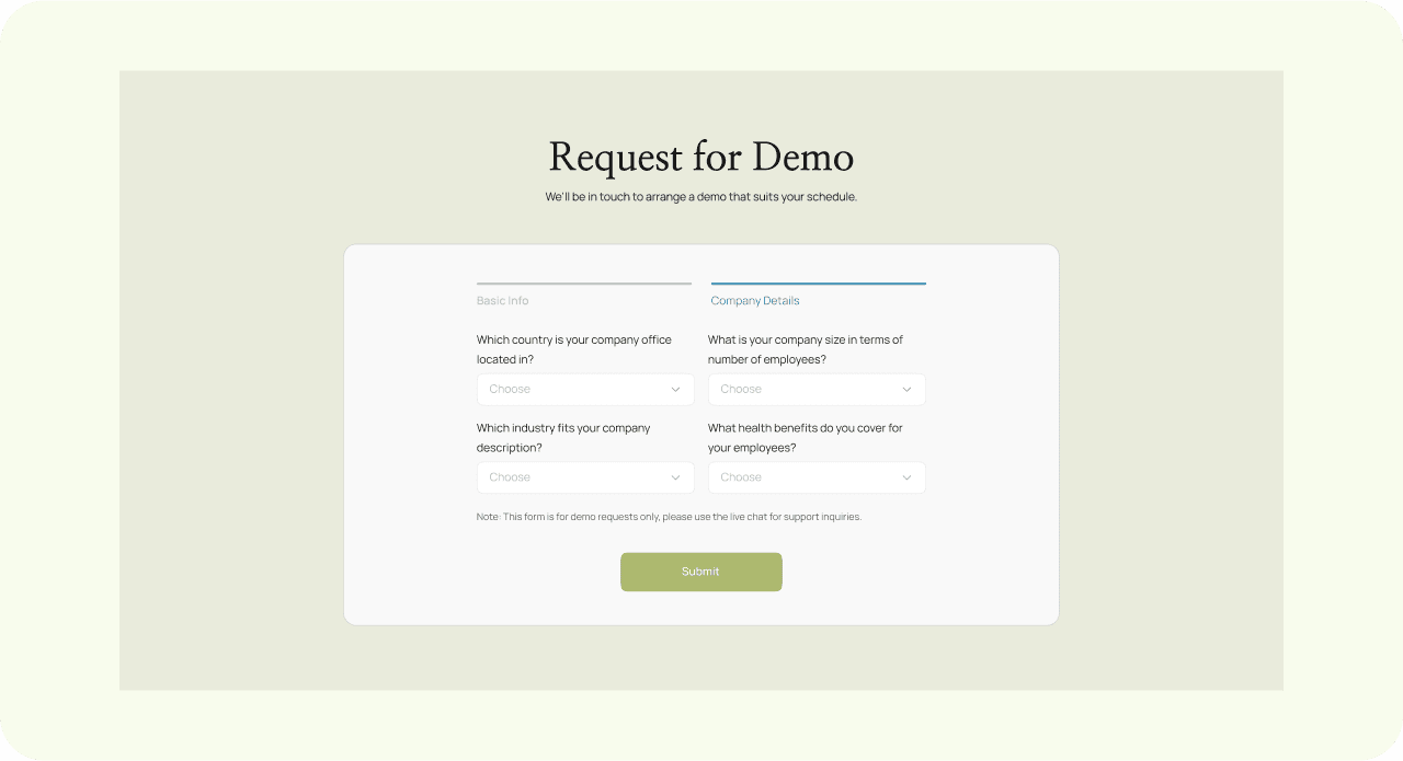
It breaks down the form into manageable steps, making it easier for users to input their information in two stages: basic personal info and company details.
It breaks down the form into manageable steps, making it easier for users to input their information in two stages: basic personal info and company details.
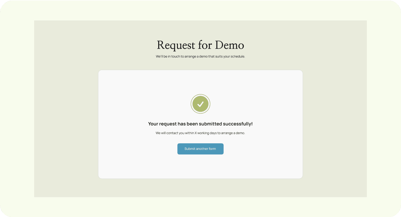
The clean layout minimises cognitive load, guiding users smoothly from one step to the next, while the final confirmation page reassures them that their request has been successfully submitted.
The clean layout minimises cognitive load, guiding users smoothly from one step to the next, while the final confirmation page reassures them that their request has been successfully submitted.
more works