Status: Launched
The Context
Hiredly is a job-seeking platform targeting junior to mid-management professionals. Data and event tracking revealed high drop-off rates occurring at various stages of the onboarding process, leading to low successful user acquisitions.
Timeline
Tools
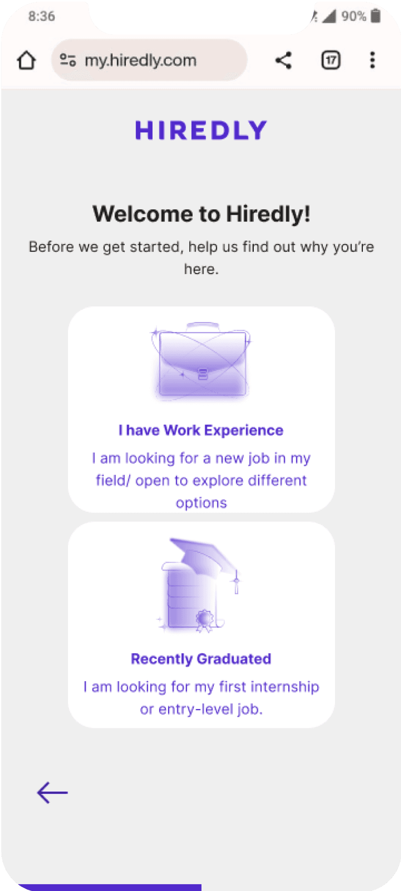
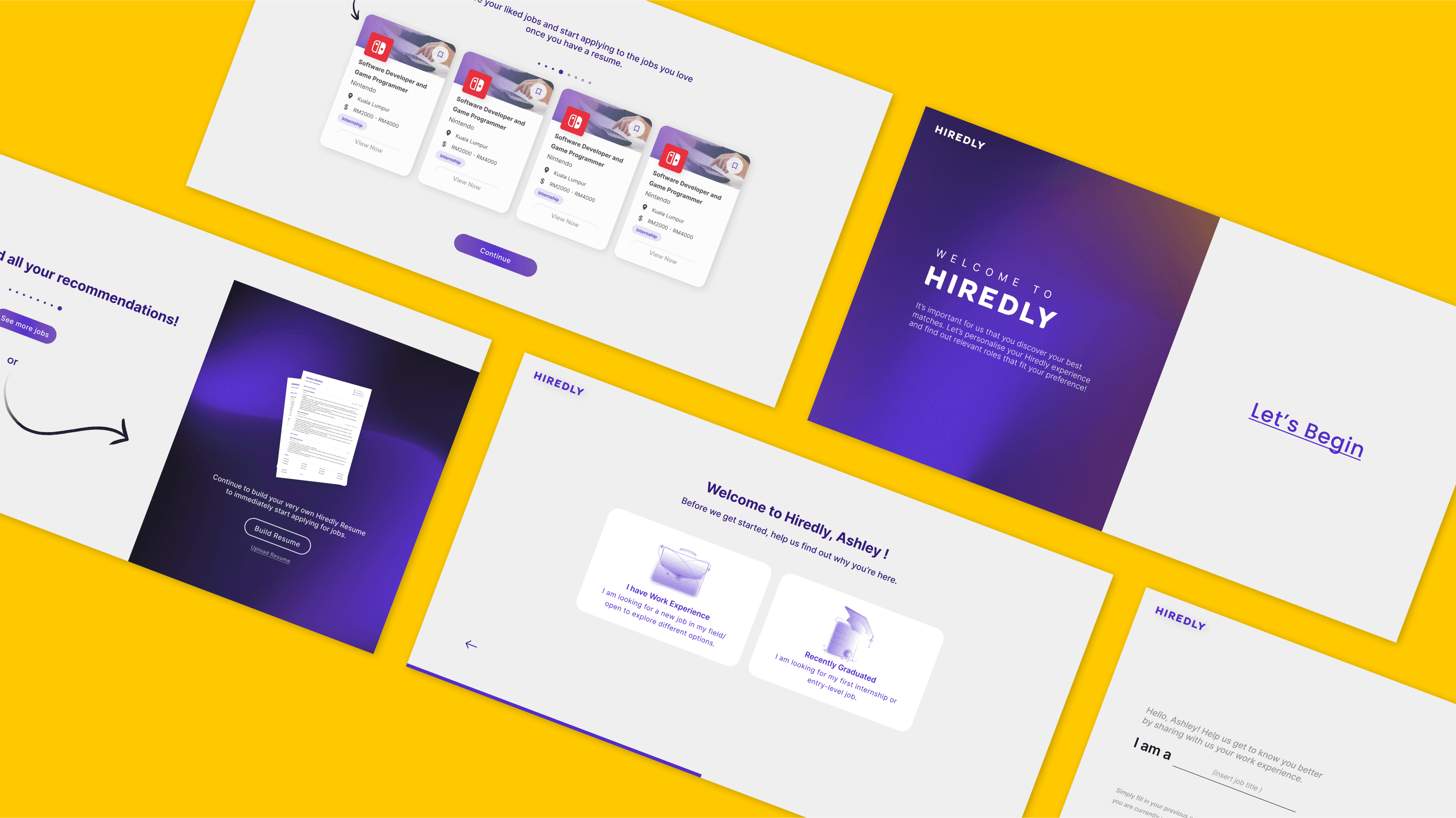
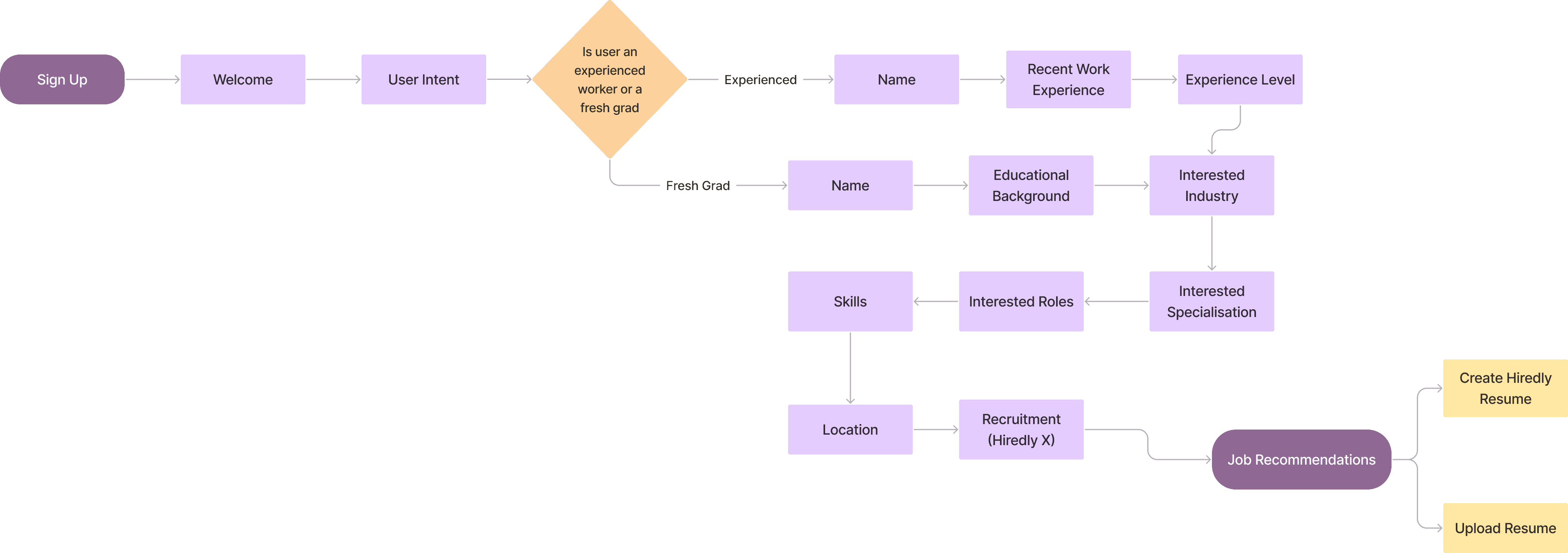
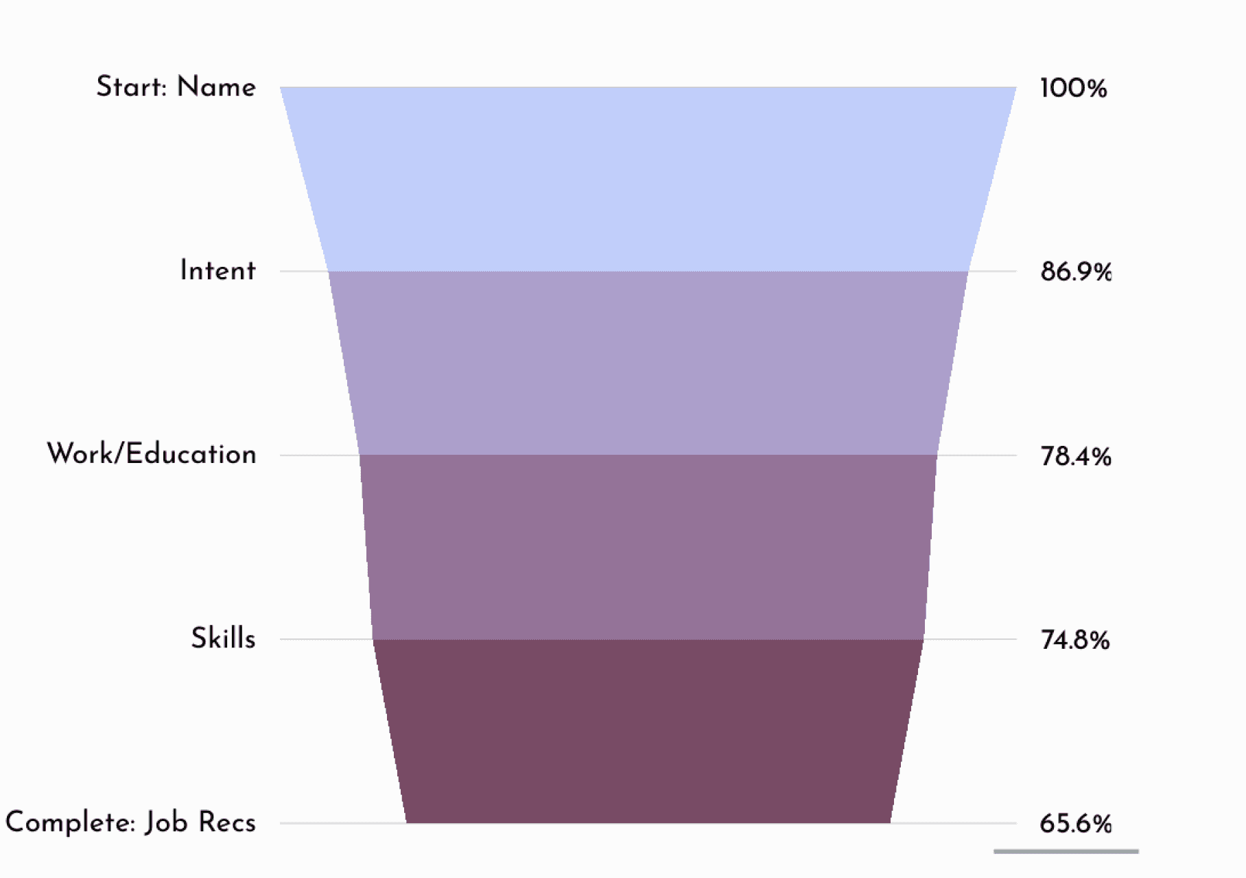
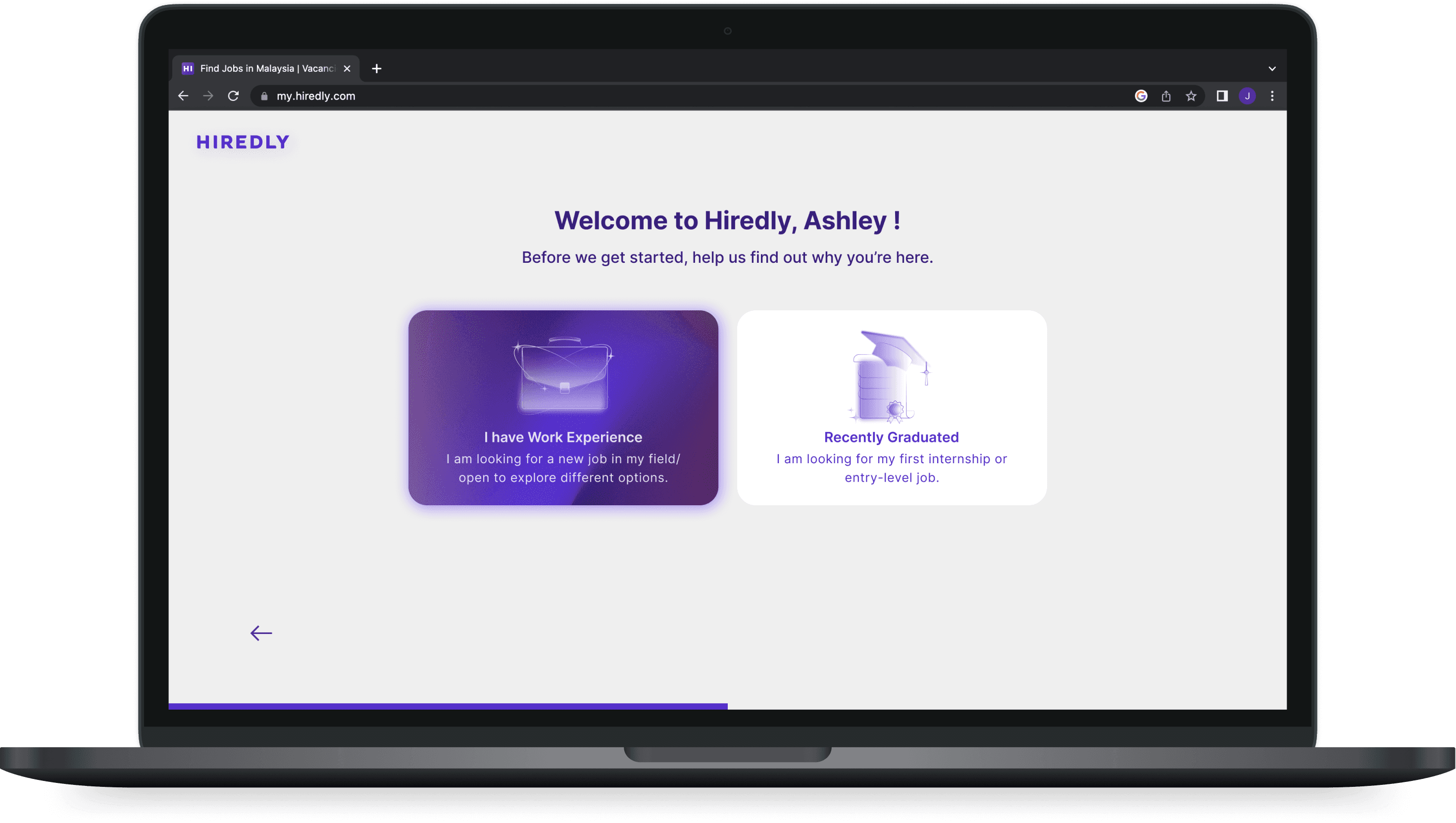
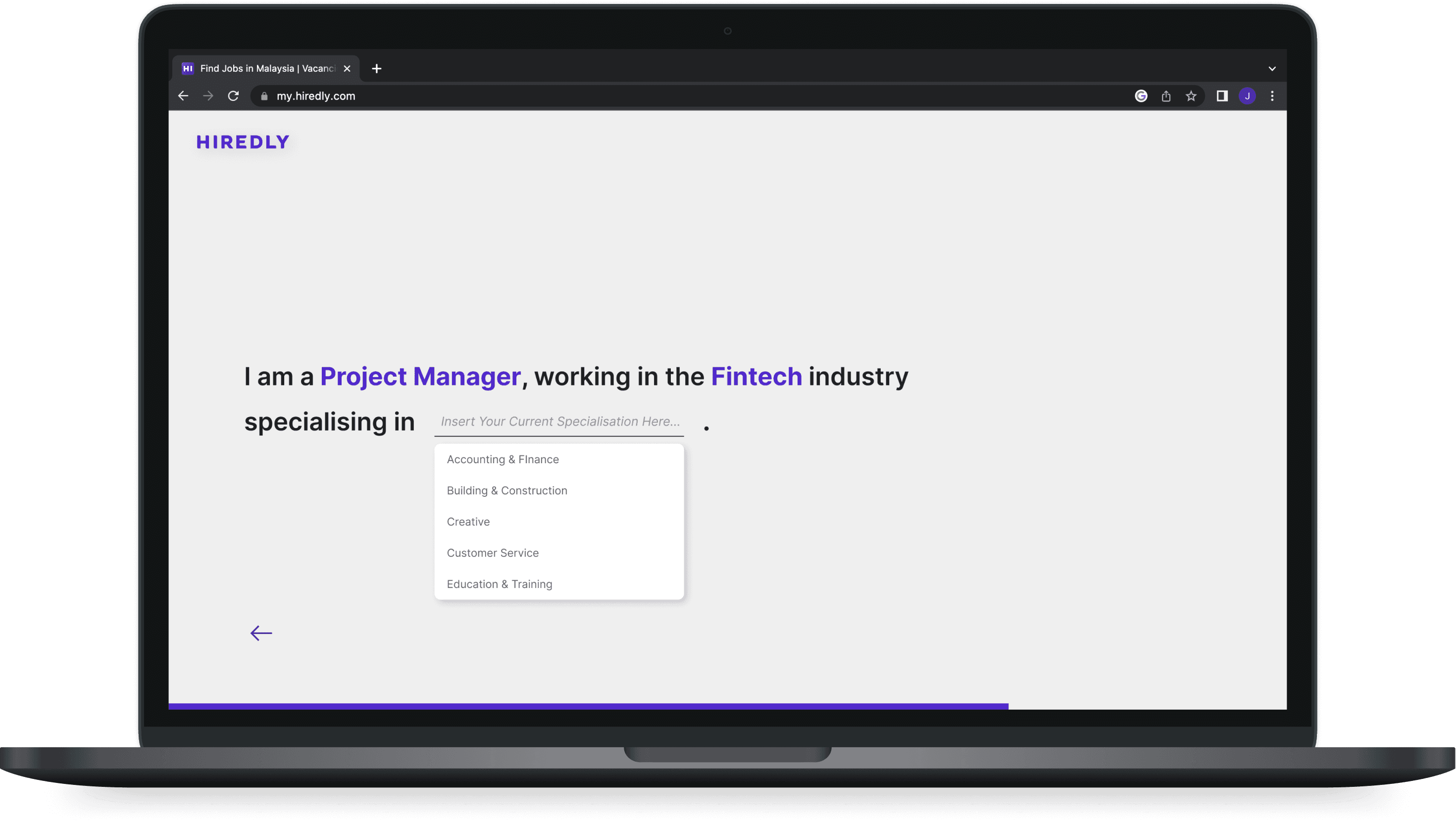
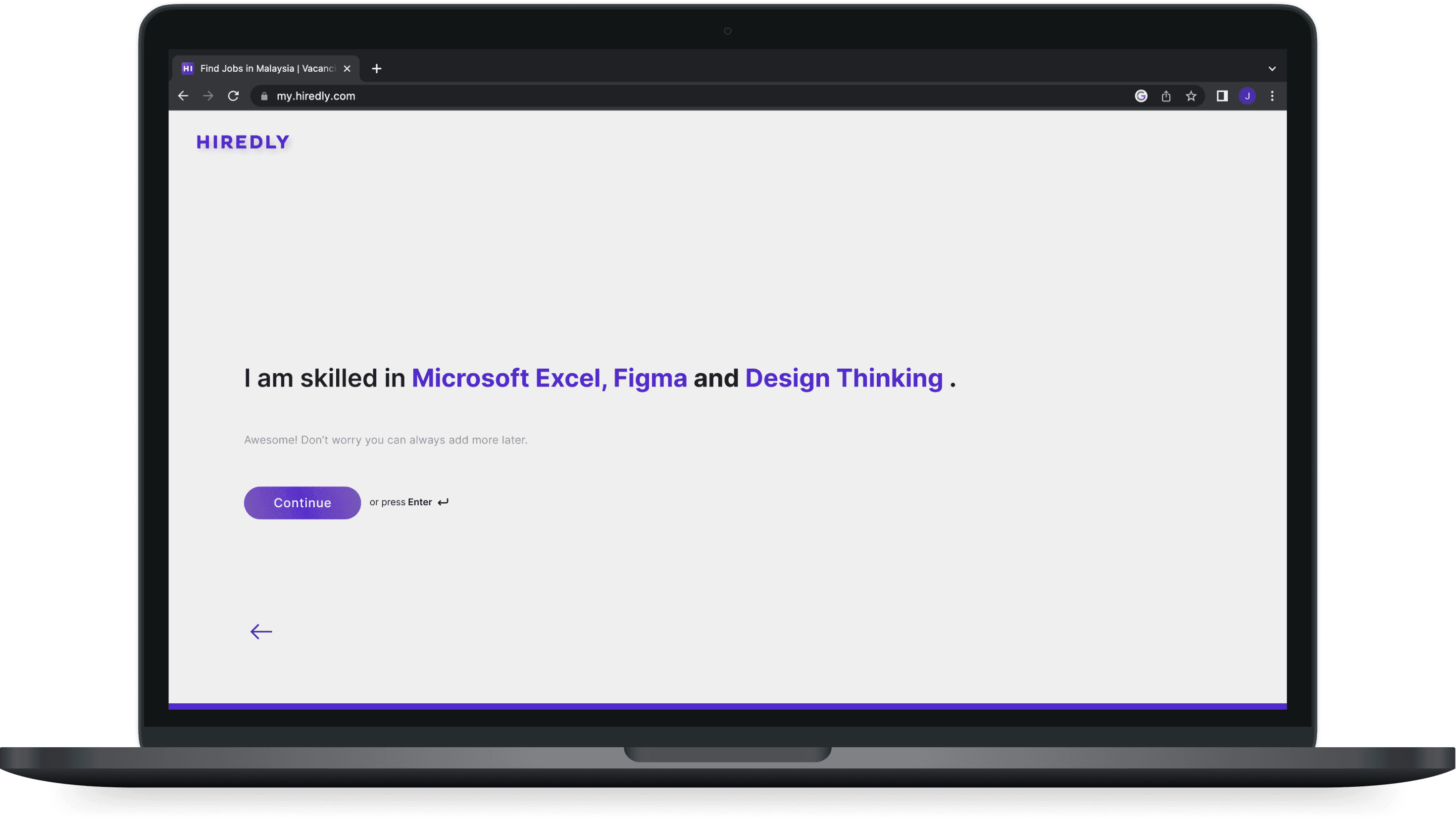
Capture user intent
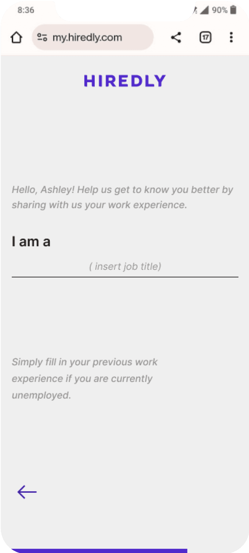
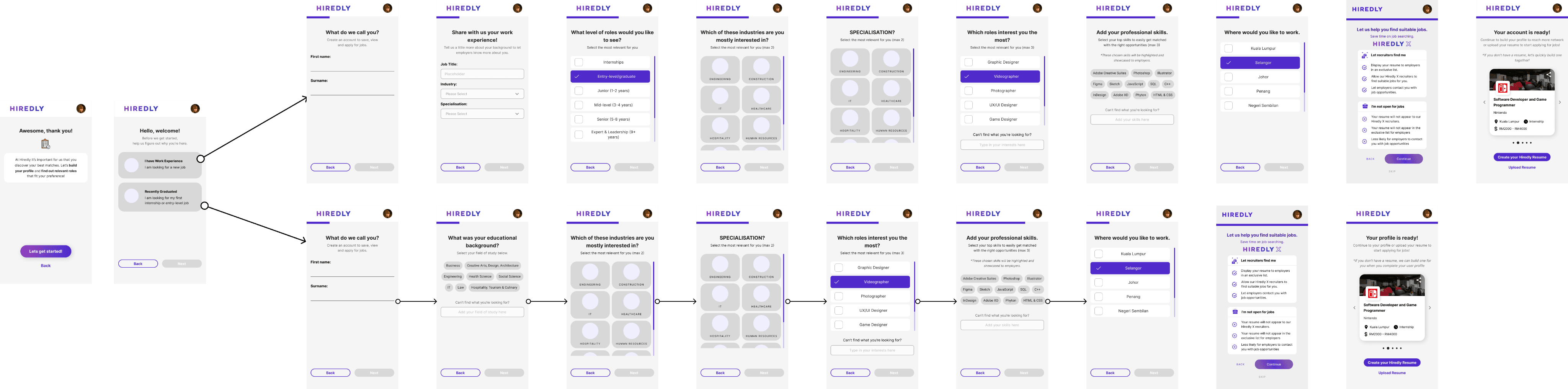
Minimal input fields
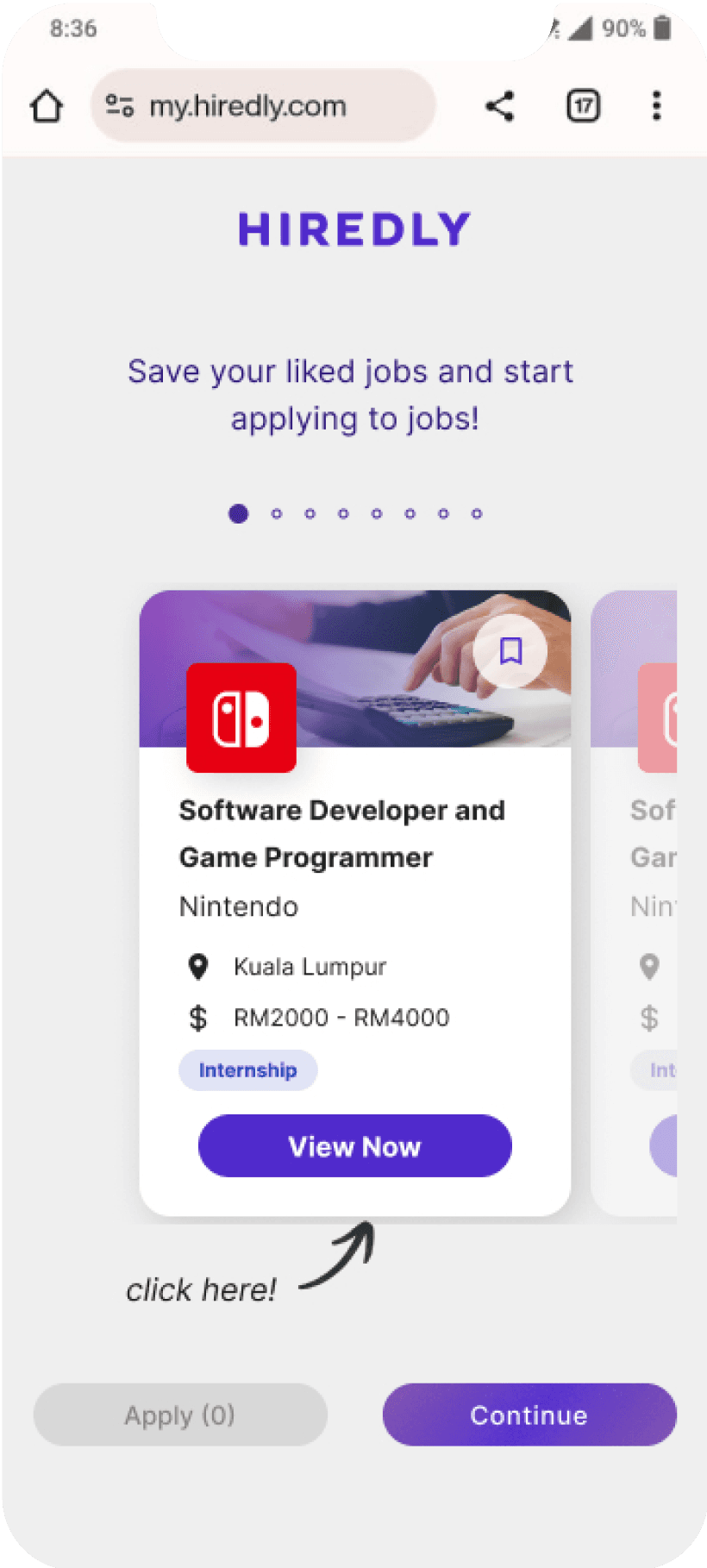
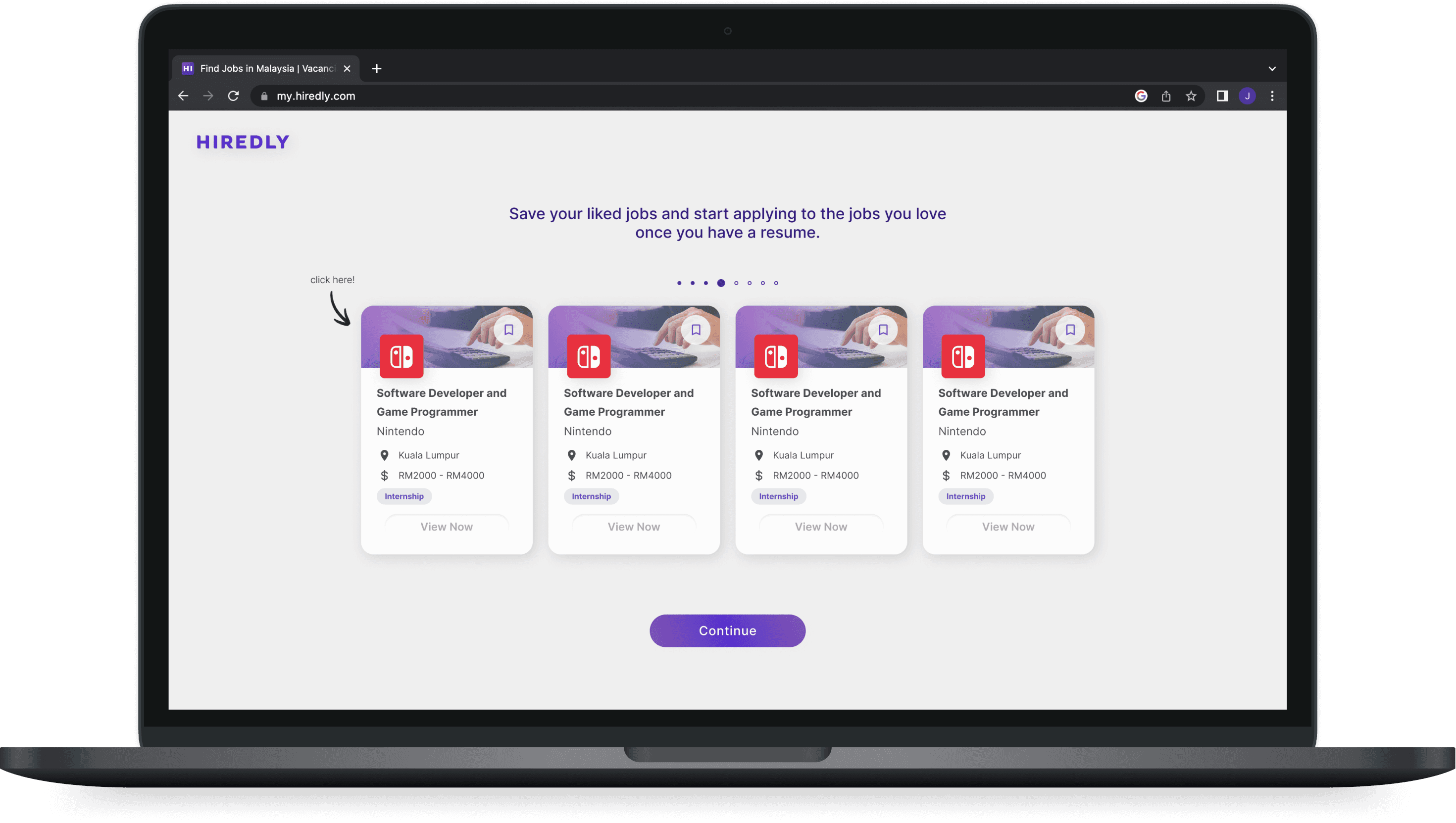
Immediate job recommendations
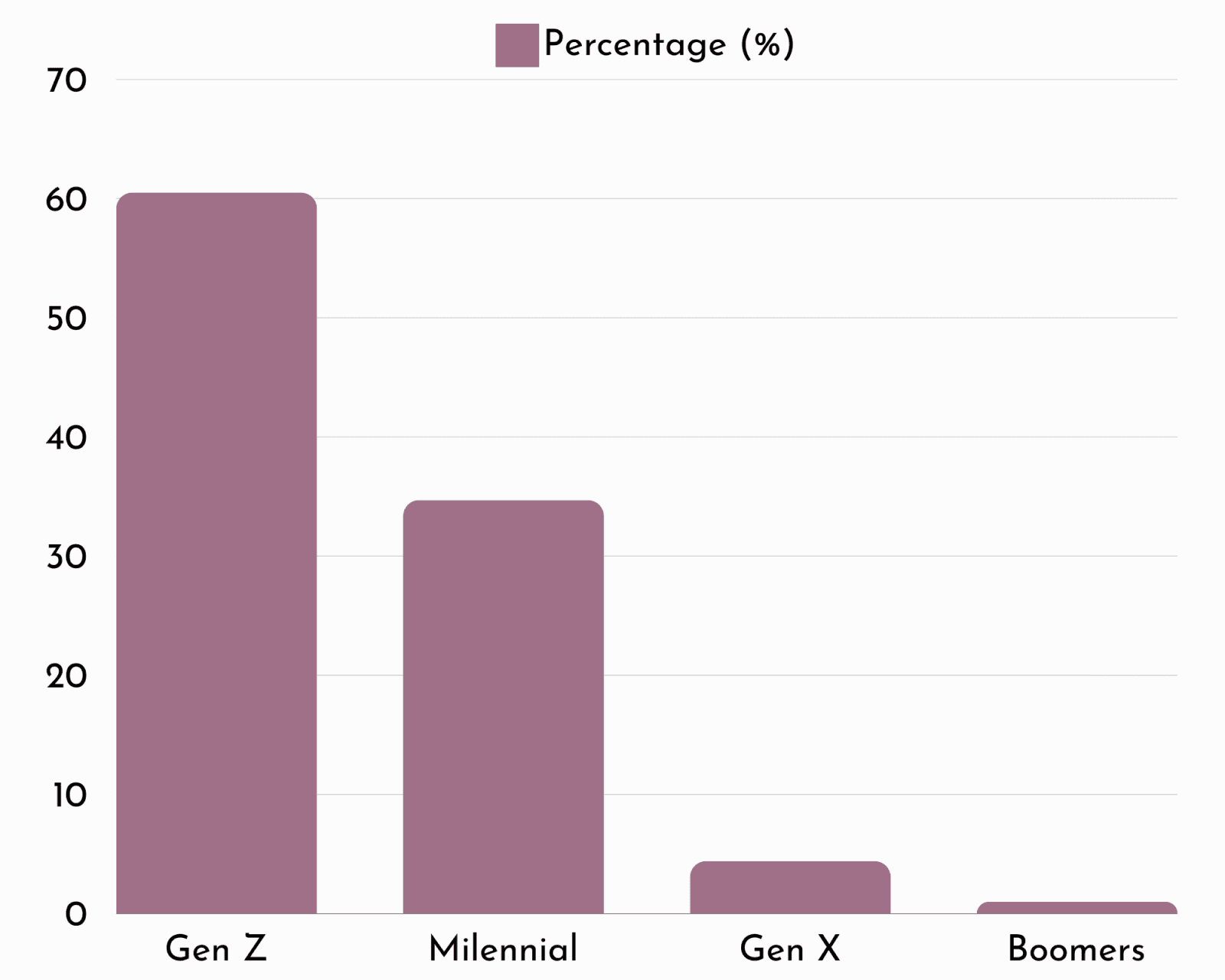
Our users can be further divided into 3 categories:

The Active Seeker:
Proactive job seekers who regularly browses job listings. They are familiar with the job search process and know what they are looking for.

The Passive Seeker:
Not actively seeking a new job but might be open to interesting opportunities. They rely on job recommendations to discover new possibilities.

The Fresh Grad:
Limited job search and application experience and might need more guidance and support during the process.
Indeed
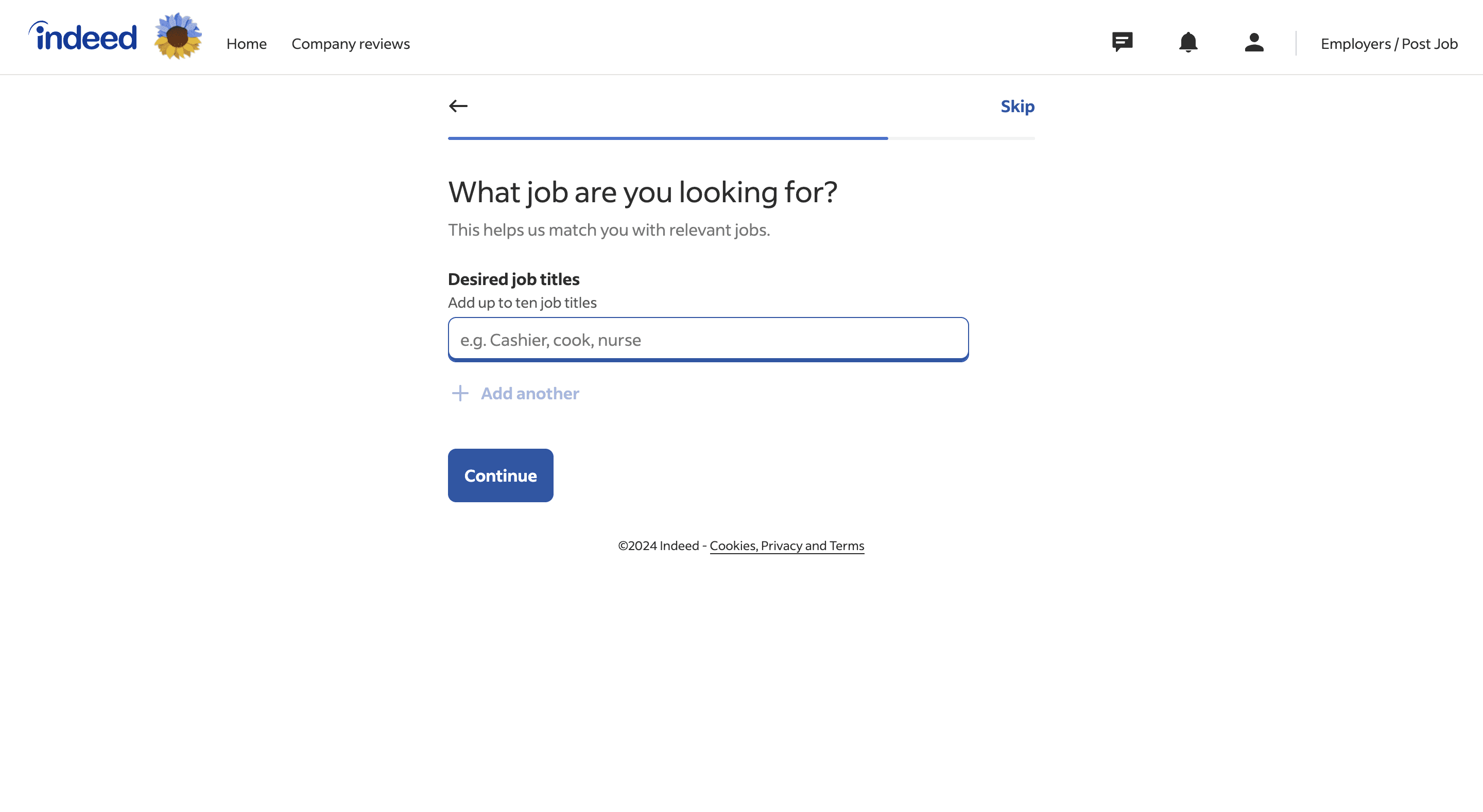
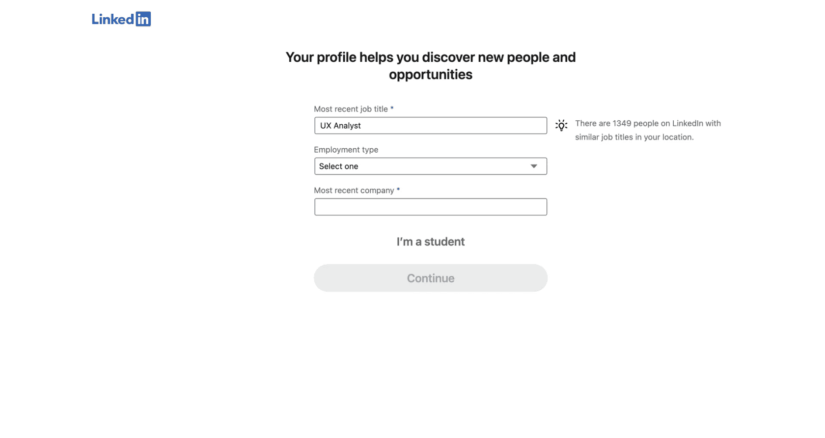
General comments from users after going through Linkedin and Indeed's Onboarding:
“Even though it was more pages, it felt faster to complete.”
“There is few fields per page, making it easy to fill in. It was not confusing and straight to the point.”
“I like how there are job recommendations immediately after, I could see how the information I gave was useful to me.”


Hiredly
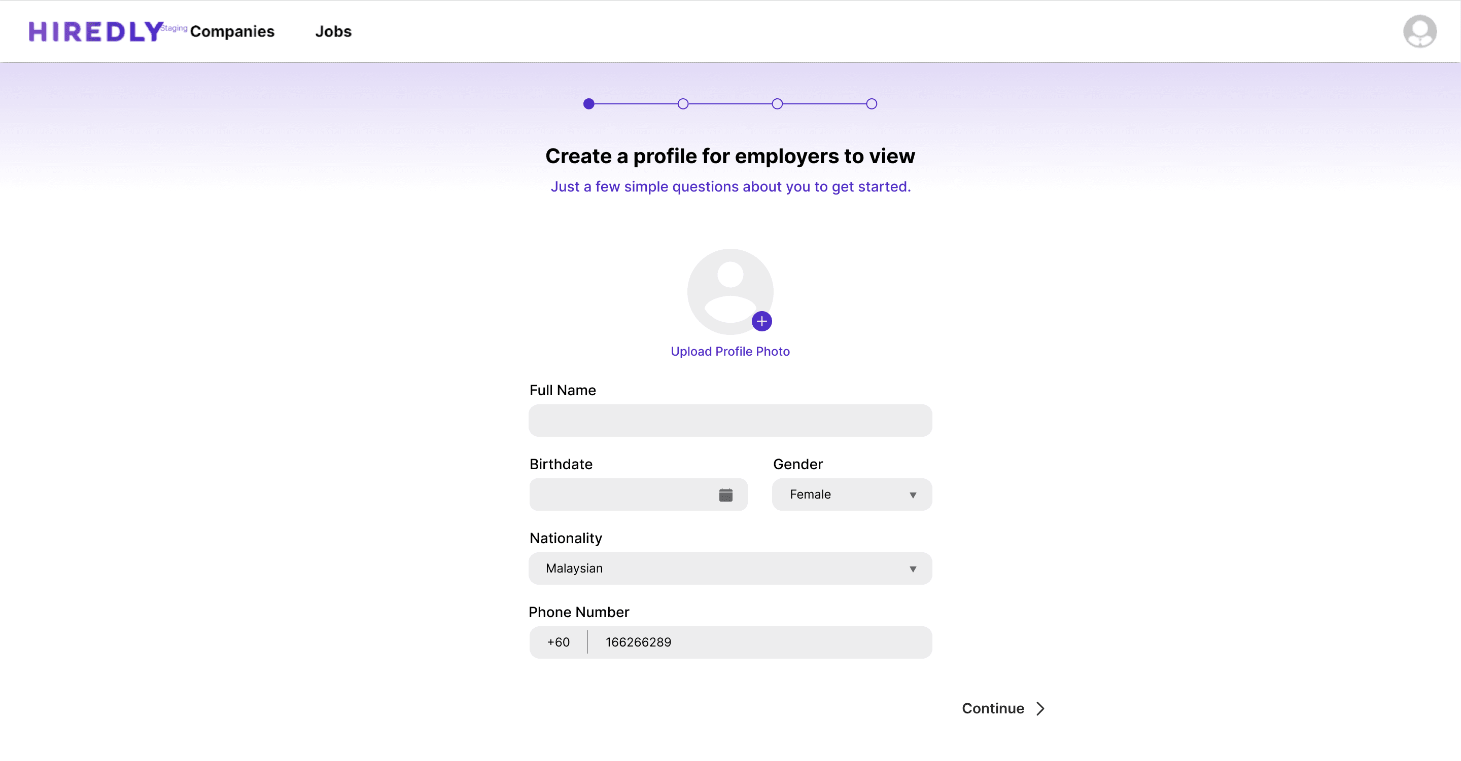
Overall UI is feels ‘old’ and ‘outdated’
The inclusion of a progress indicator is a good feature
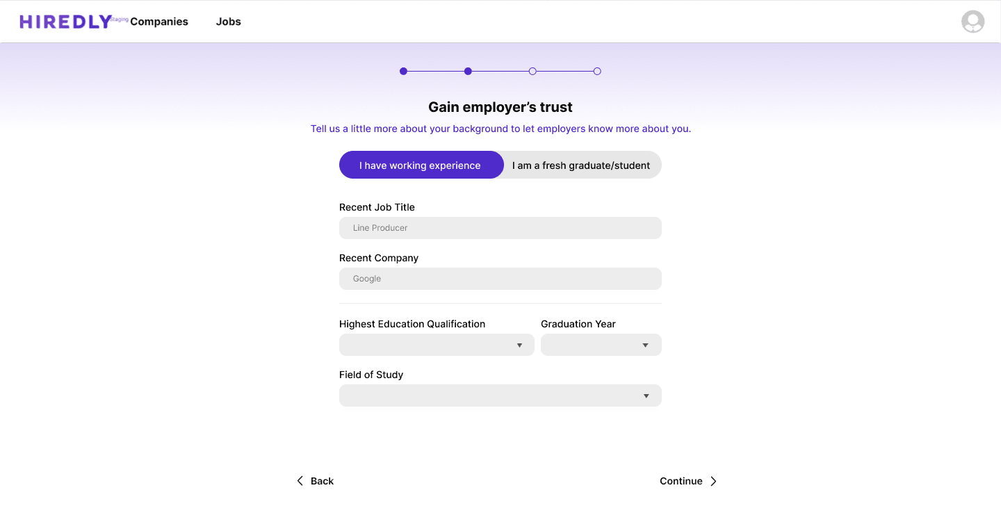
Fresh grad & working exp tab unclear. eg: does internship experience count?
blocker for the Fresh Grads
Unclear which fields are the compulsory fields
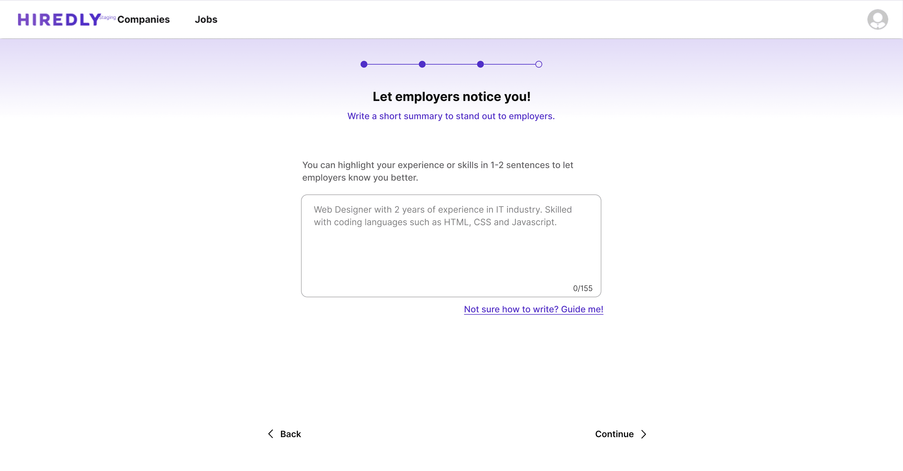
Long text field required to fill before continuing, user unsure of the use of this information
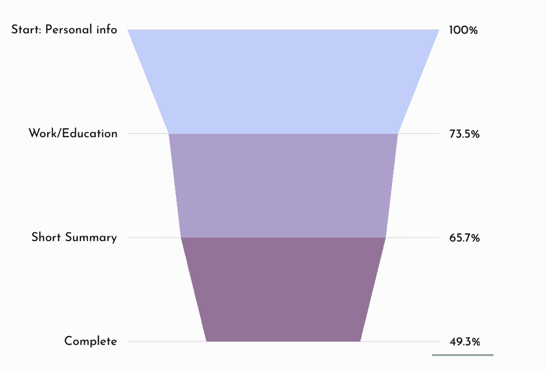
Page with highest drop-off rate
Potential reason:
this is not a ‘common question’ with other job portals, the higher effort required here is a potential blocker to users like the Passive Searcher and Fresh Grads to complete the onboarding process
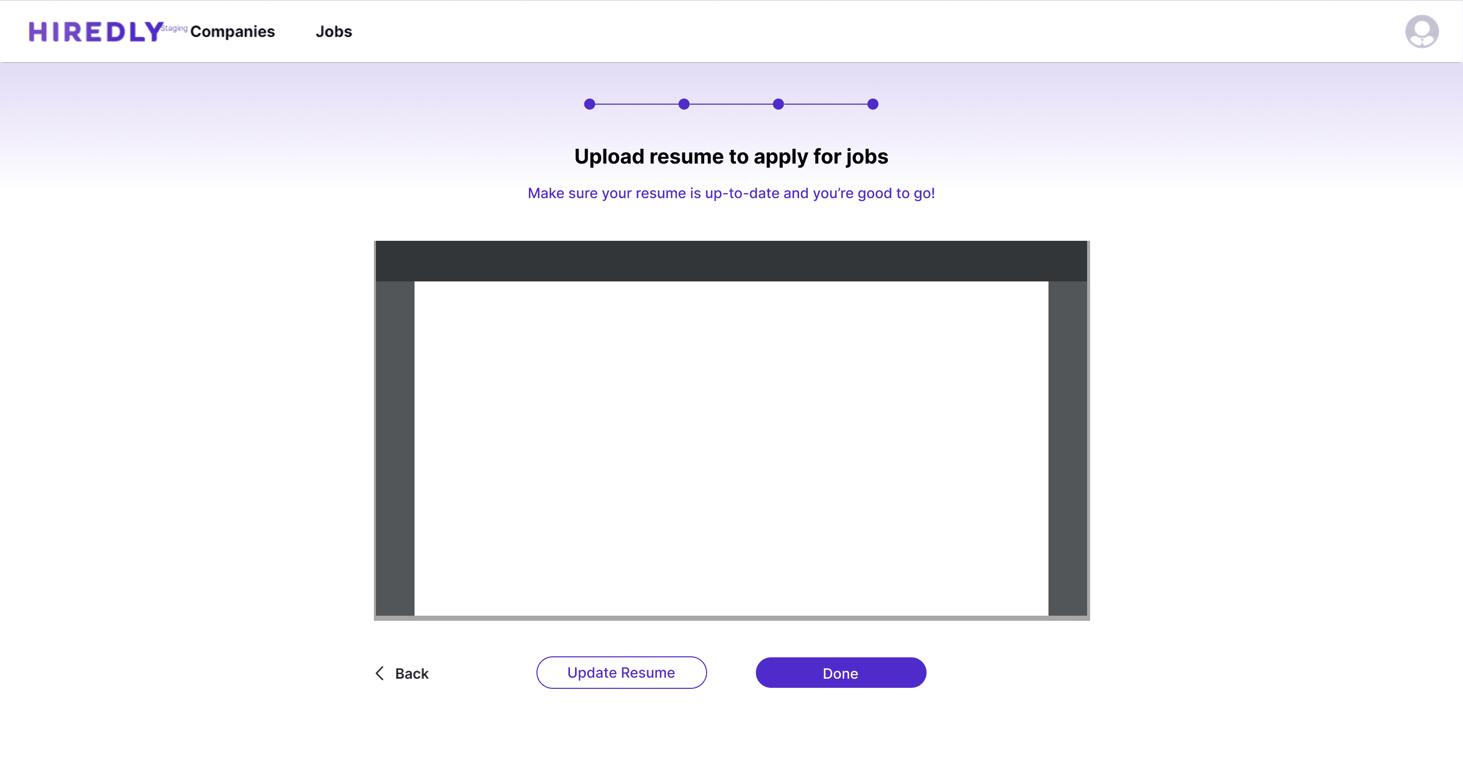
What happens now after filling in all my information?
CTA copies are not clear
Highlighted user behaviours from user interviews + observations and online research:

Importance of Visual Appeal:
Highly influenced by visuals and prefer aesthetically pleasing interfaces

Shorter Screen Attention Span:
Accustomed to consuming content in brief, bite-sized chunks with the high exposure of social media content

Instant Gratification or Reason:
There’s no clear reason or ‘reward’ from completing the onboarding process

Highlighted design decisions:
1
2
3
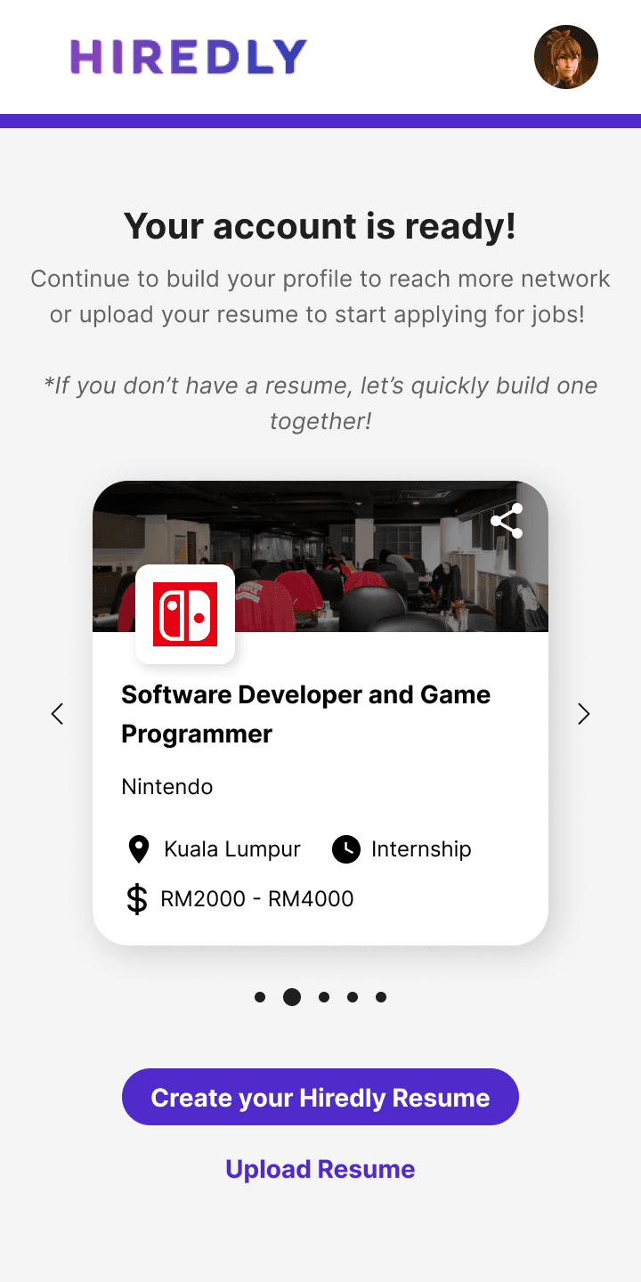
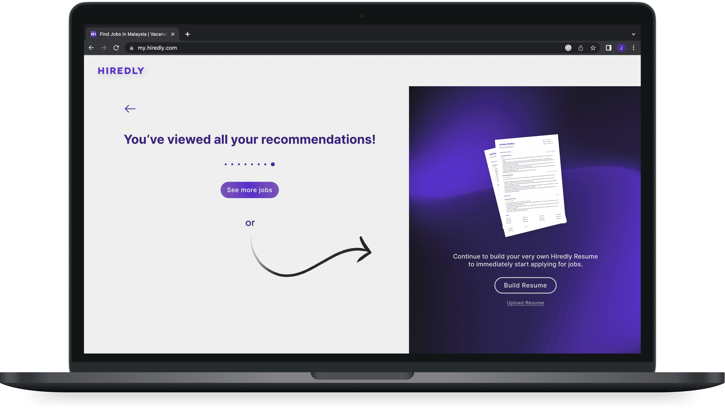
However the new additional fields made the journey much longer even with the one field per page approach. The reward at the end is a nice touch, but there’s too many action options for users to make: view recommended job, create resume, upload resume. Yet it’s still missing the main user goal.... Searching for jobs!
and so I took a step back again:

What exactly are the essential fields to provide job recommendations to users?
How does the journey end?
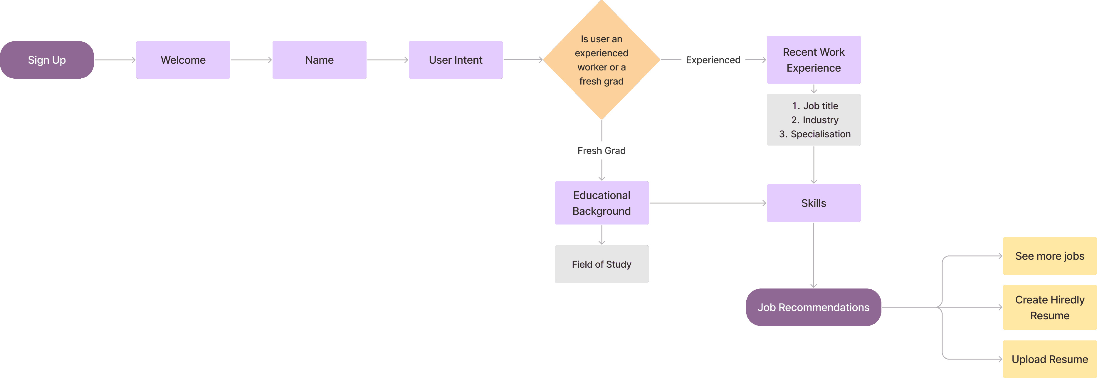
Looking back to our user groups we refined the ending page to redirect them to pages that are most relevant to their goals:
The Active Seeker

Relevant actions/pages:
Jobs Page
Uploading Resume
Create Your Resume
The Passive Seeker

Relevant actions/pages:
Jobs Page
Uploading Resume
Create Your Resume
The Fresh Grad

Relevant actions/pages:
Jobs Page
Create Your Resume
Finishing touches to the flow:
Before
After
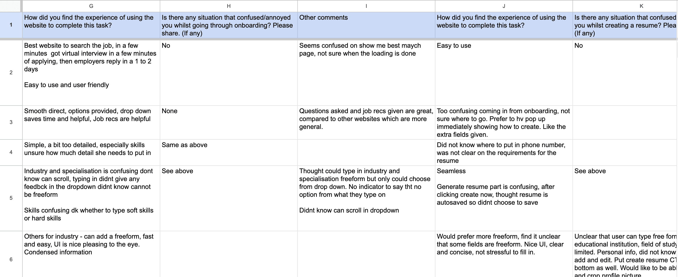
On March 2023, I had the opportunity to directly conduct usability tests and gather feedback from our users at Hiredly’s Career Fair.

We gave our users a task:
You are a new user and would like to create an account to apply for a job.
more works