Status: Launched
‘Ashley ah, you everyday so free, nothing to do ah?’
- Ashley’s Mum 2024
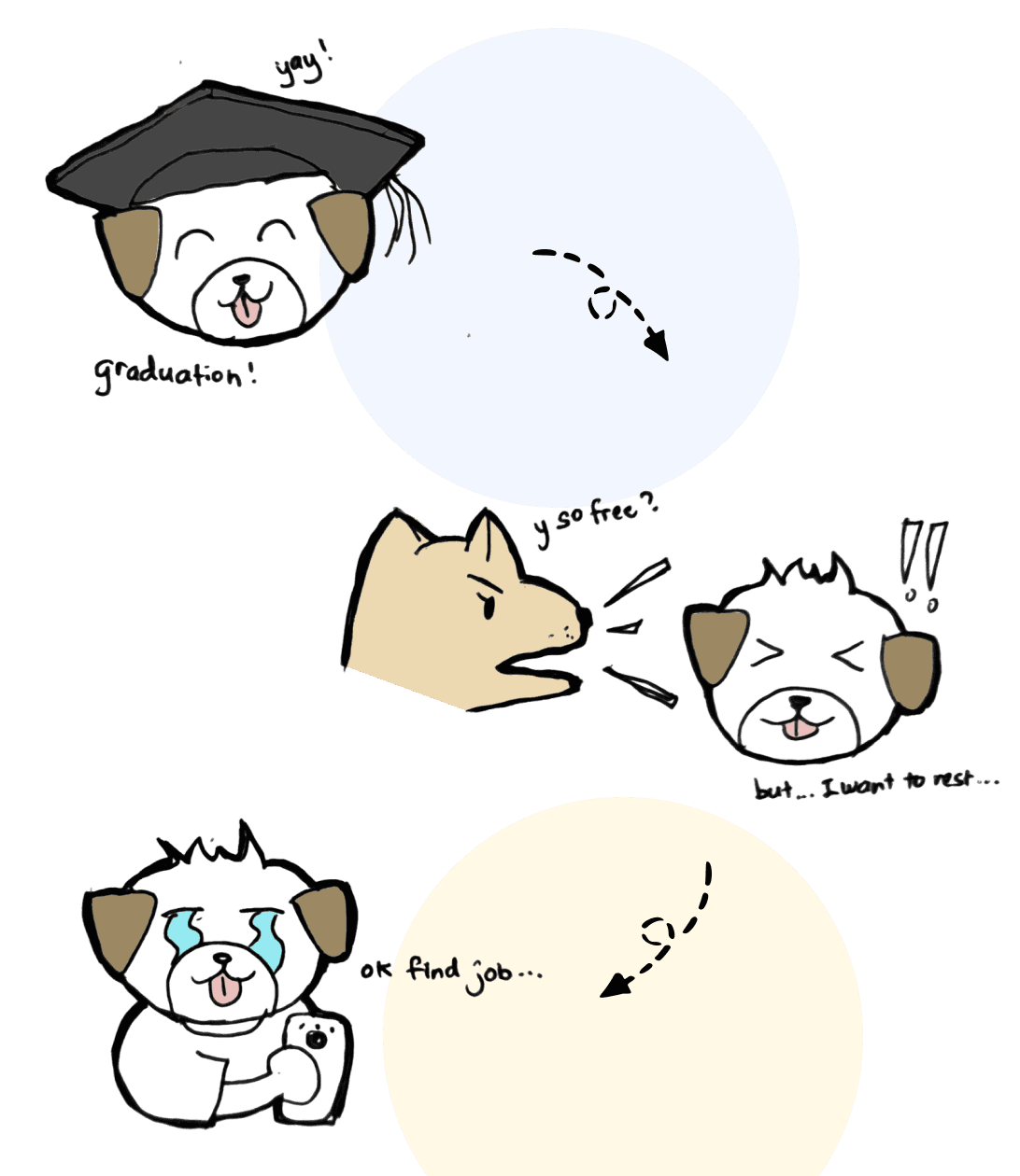
Ashley’s journey through Hiredly:
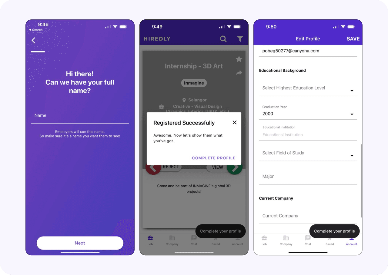
Sign up > Complete profile
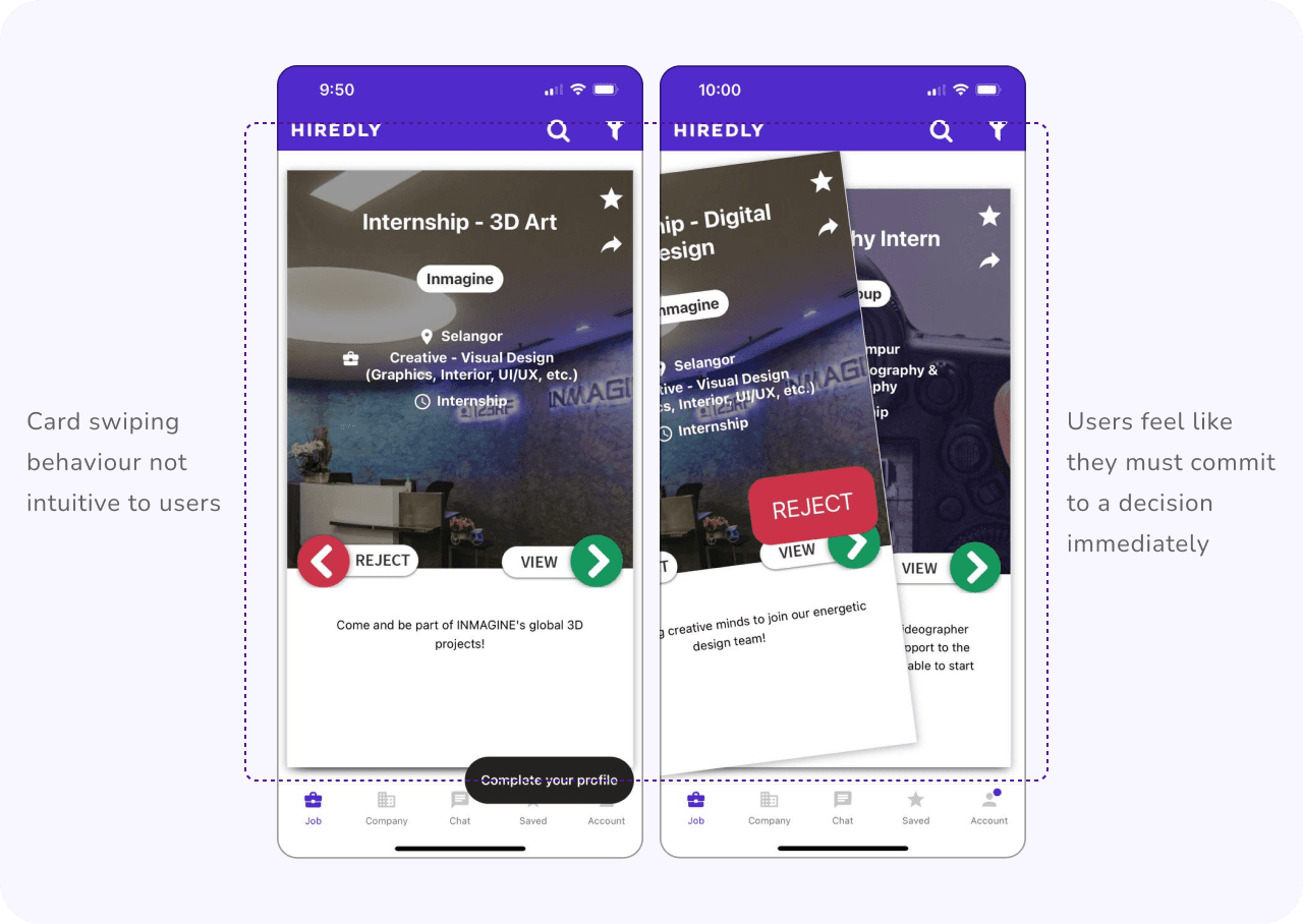
Searching for jobs
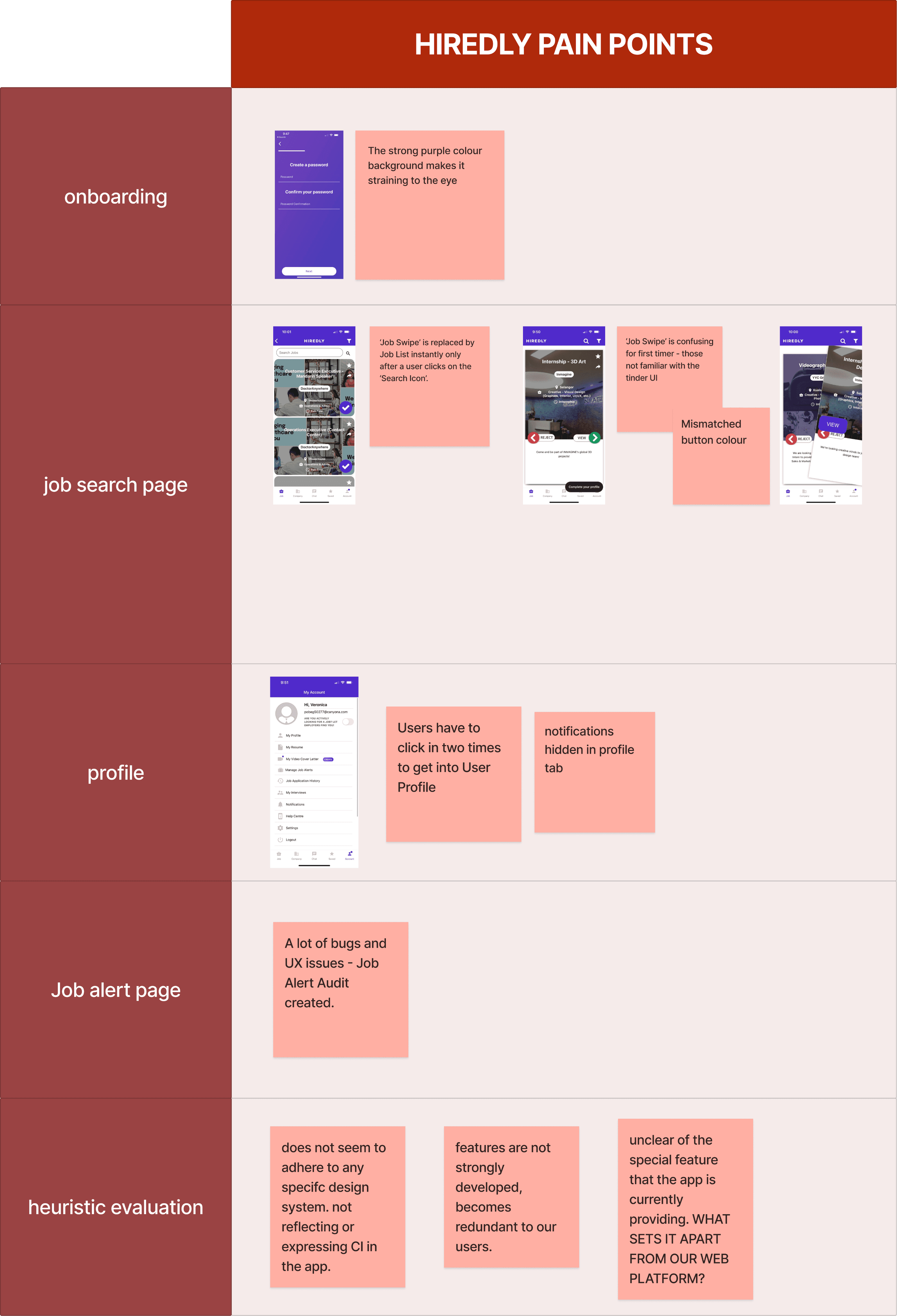
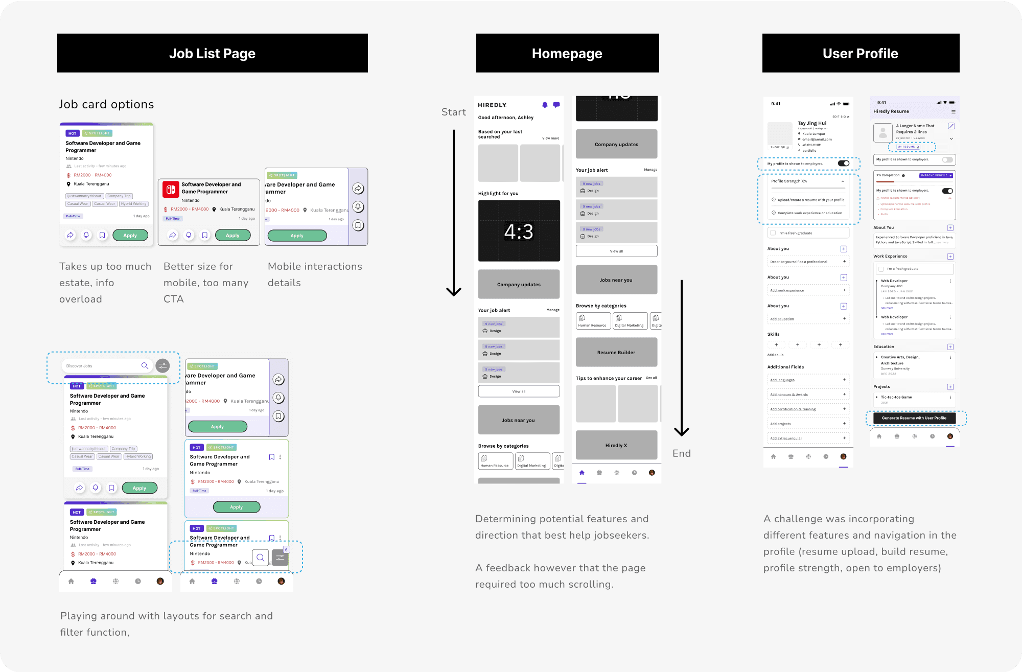
There was no homepage that is usually common within mobile apps, instead its straight to view jobs. Ashley is once again confused with the unusual jobs page with a behaviour similar to Tinder. What happens when Ashley swipes to reject? Will she ever see it again? Ashley isn’t ready to commit to that!
Response from User Survey 2022:
“Some jobs I don’t mean to reject, just need some time to consider, and may want to have a second look at after looking at other opportunities”
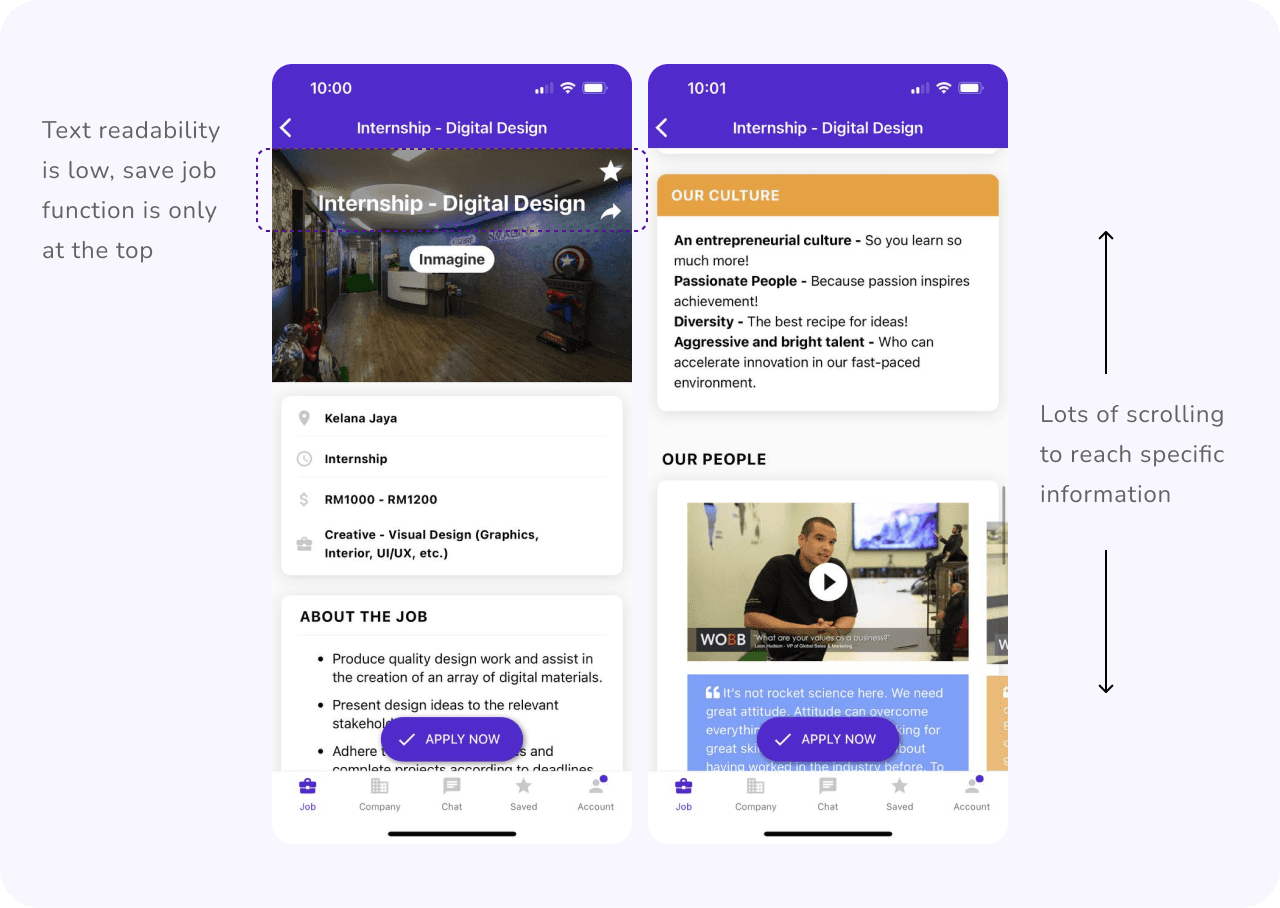
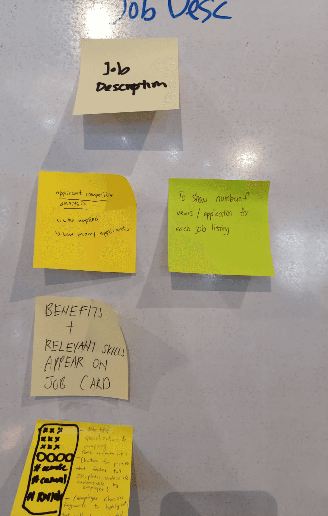
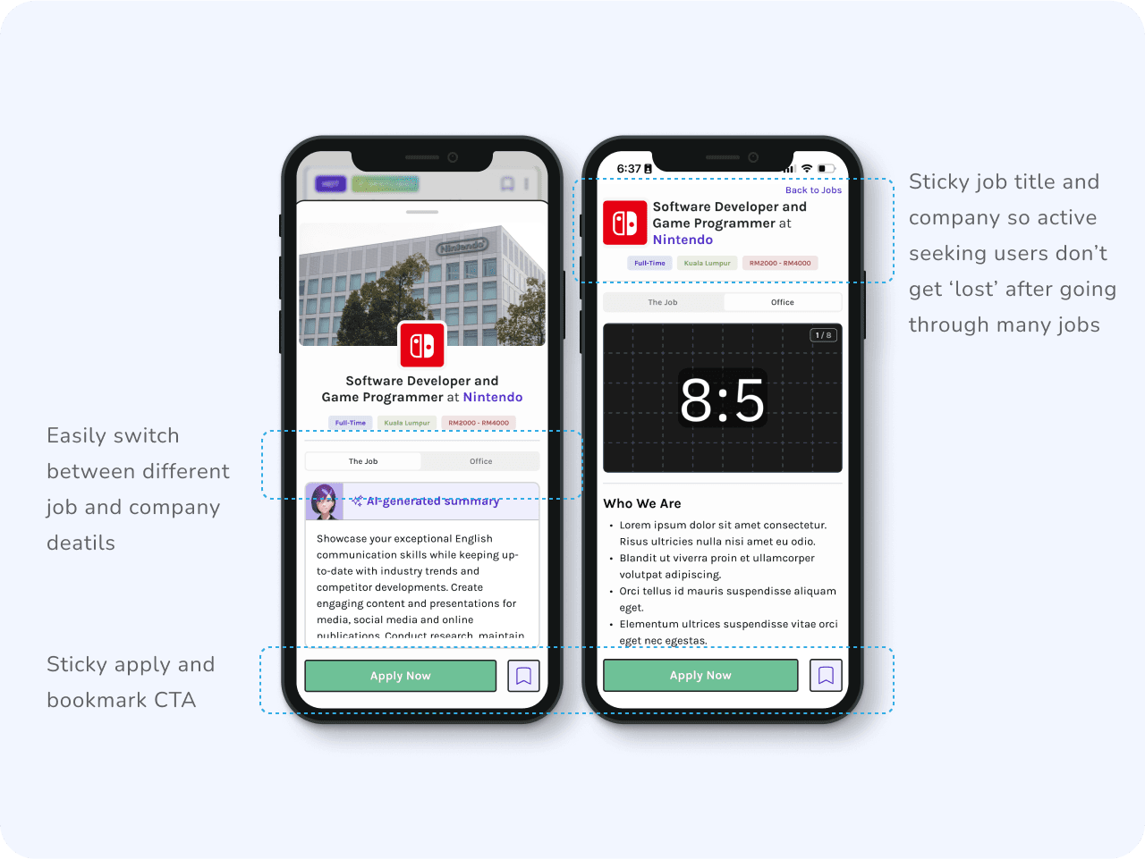
Job and company details
Ashley finally found a job she’s interested in. She reads through both the job and company details available in detail. She scrolls all the way down the extensive information, and up again, and down.... she’s unable to view between both information easily.
Response from User Survey 2022:
67% of our users find the company profile and media helpful when considering which job to apply to. How can I make this info more accessible?
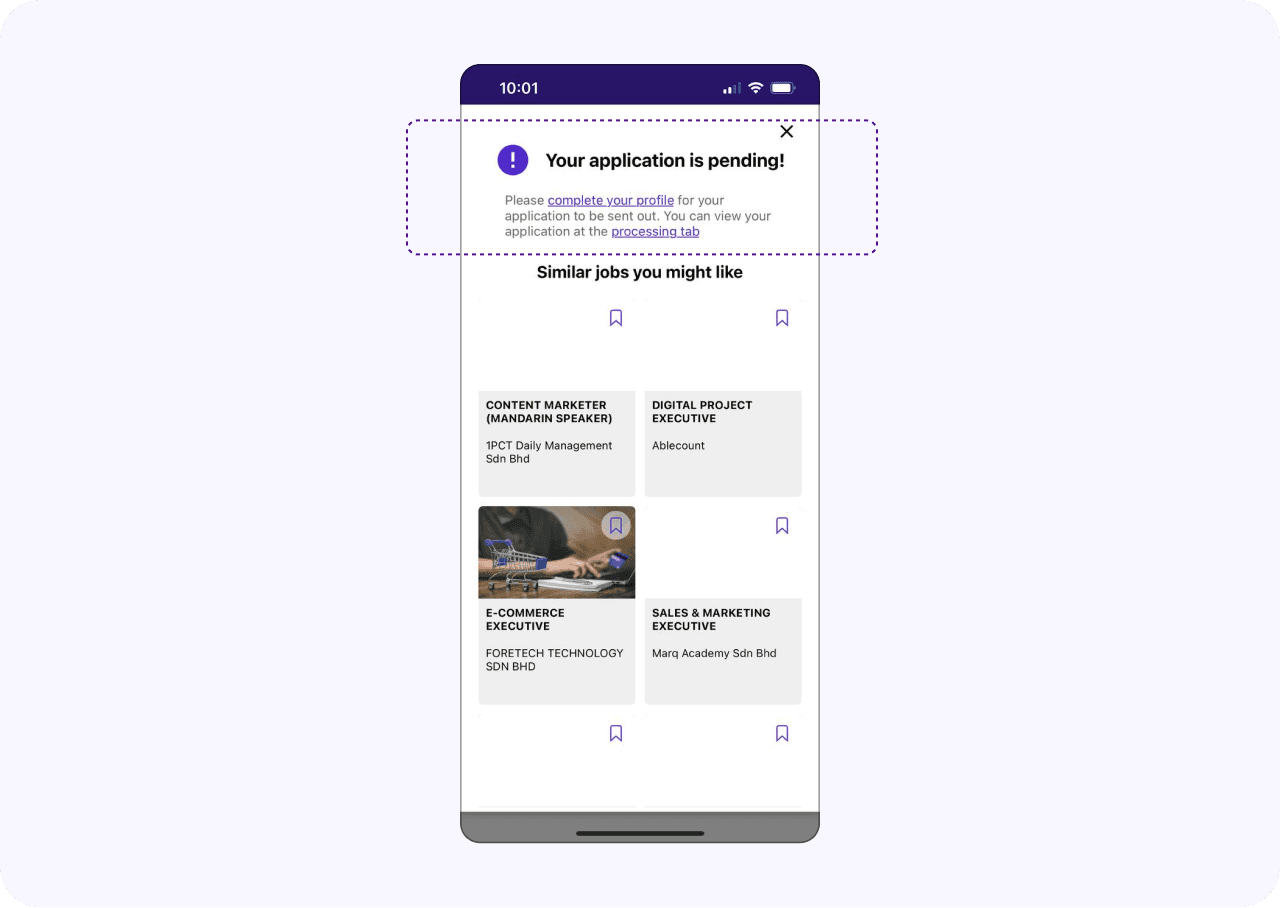
Making the application
Ashley is now committed! She makes the application and she realised... its pending? She’s already completed her profile. The information was unclear, that a resume is also a requirement for a successful application!
The Brief
Redesigning the UIUX of the whole Hiredly mobile app, in return improves the job application process experience that caters to the younger generation.
Team
4 UI/UX Designers, 1 Project Manager, 2 Front-End Engineers, 1 Back-End Engineer.
Tools
Figma, Figjam, Lottiefiles, Lottielab

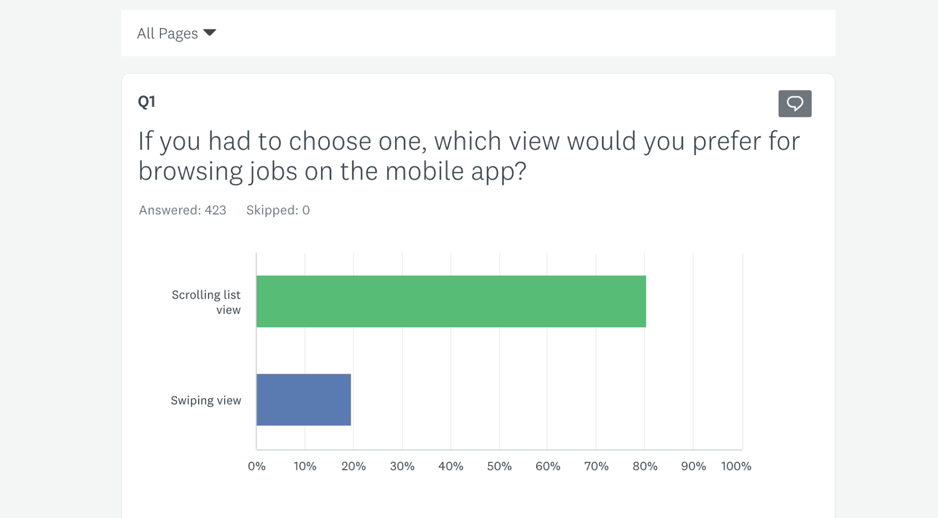
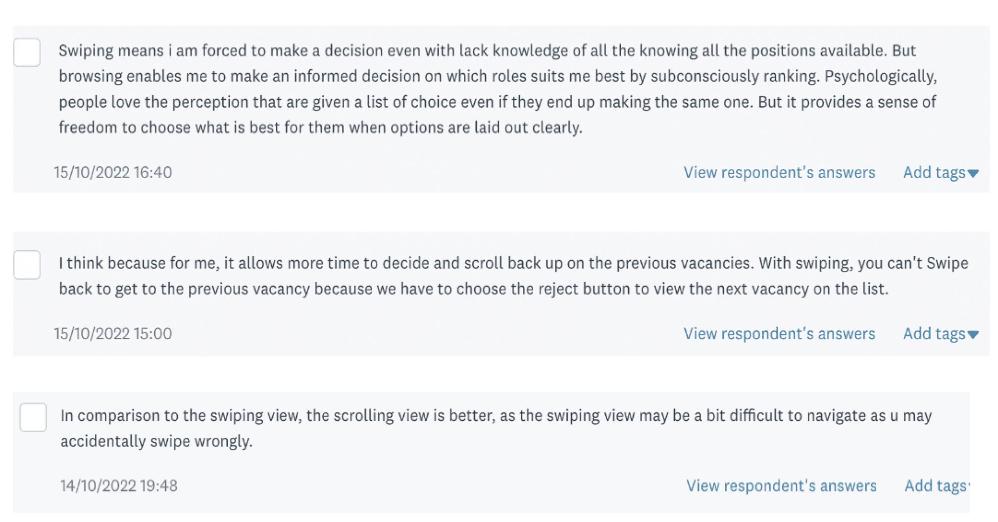
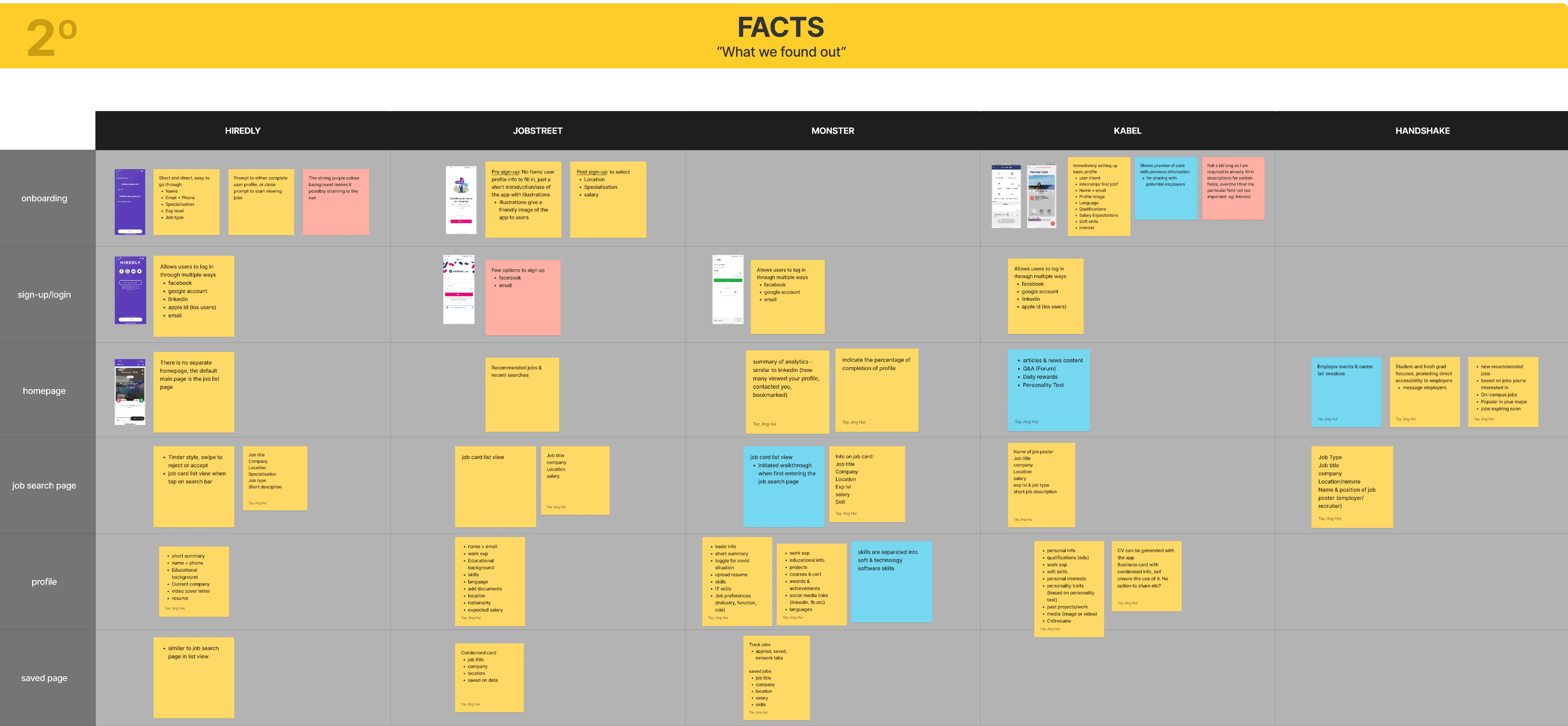
81% of users prefers the regular scroll list view over the swiping motion when looking for jobs.
67% of our users selected company profile and environment as the most helpful feature.
User are not aware of certain features that we already have. eg: undo application, notifications, certain filters etc.
Visuals Attract
Users are drawn to visuals. How can we help employers stand out through branding and culture?
Simple Does Work
Sometimes we don’t need to reinvent the wheel. Making sure that the features are intuitive and easy to use are even more essential.
Navigation
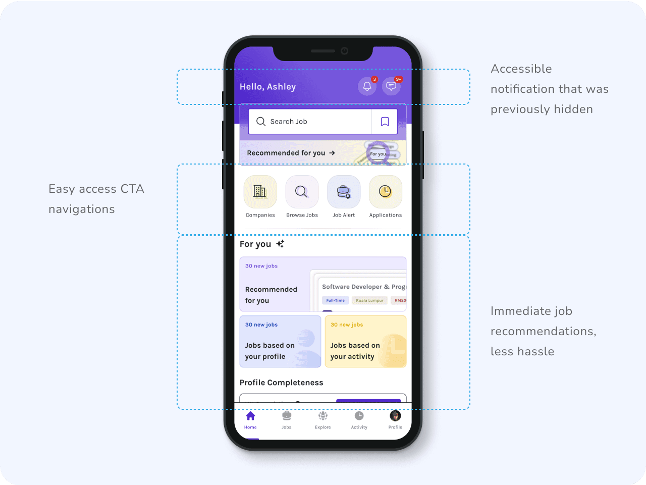
There are interesting features in the old app that is useful to the jobseeker, but are hidden or difficult to access. How do we bring those forward?
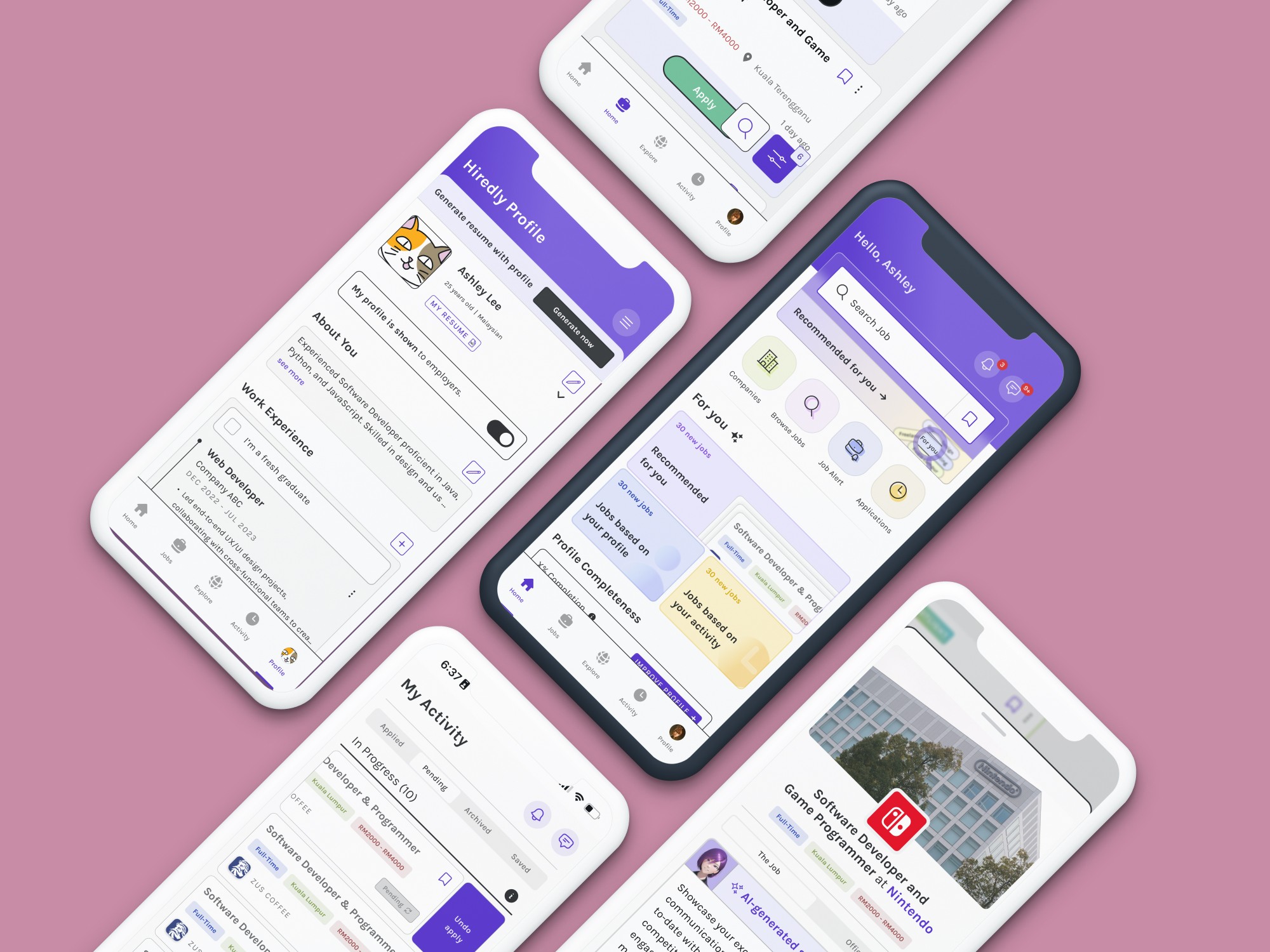
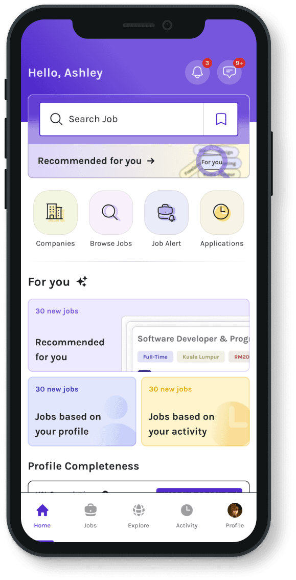
Before applications
Important information a tap away
A new homepage was introduced as a ‘lobby’ for users to easily view a summary of relevant job matches based on their profile and activity, as well as easy access to multiple highlighted pages on the app.
Before applications
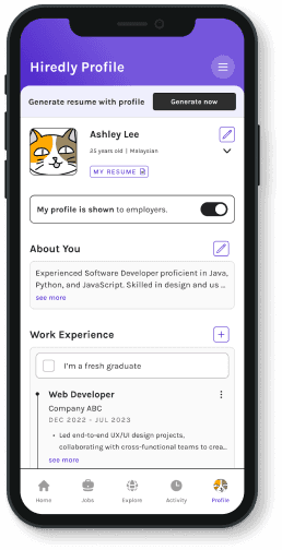
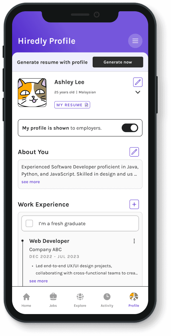
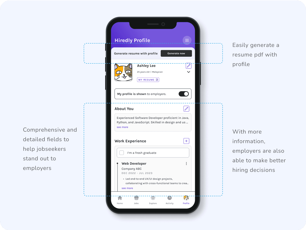
No Resume, No Worries!
Main demographics of the app is fresh grads to mid-level job seekers, who require more support in creating their resumes. Users can now fill in their information and easily generate a downloadable pdf for applications.
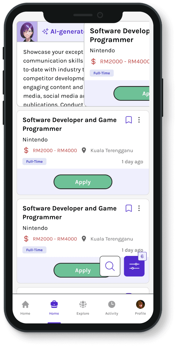
Making applications
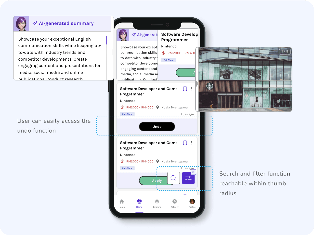
Beyond the Job Title
Helping users to quickly understand the job beyond the title through short summaries and highlighting the company’s branding and culture through media,
functions such as undo and search + filter are also more easily accessed.
Making applications
Digestible Information
Users can now easily go back and forth between job and company details through the sticky tabs. Keeping the information in each scroll more relevant and straightforward.
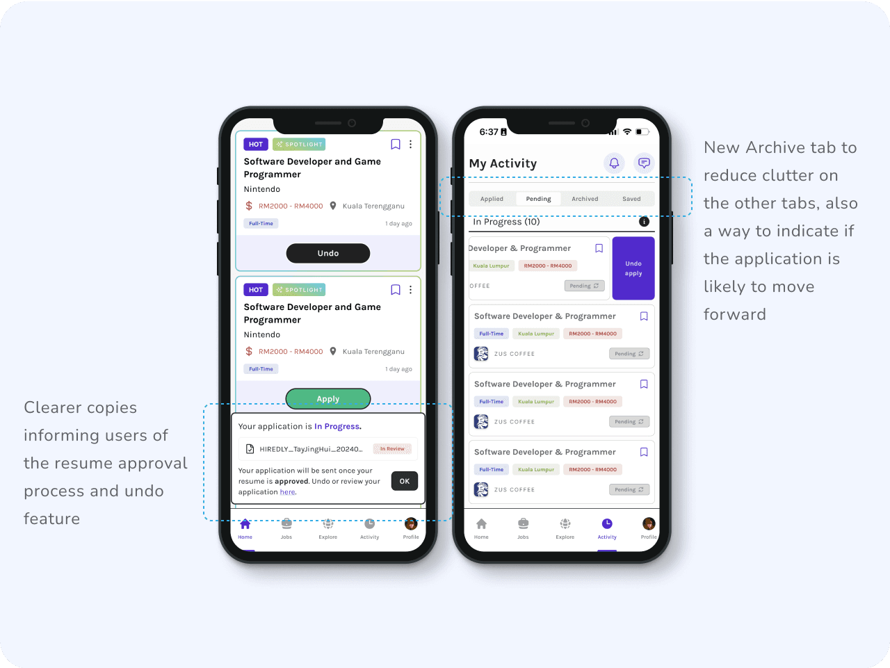
After applications
Easy Updates
All user activity such as application status and saved jobs/companies are categorised in the same page. User can also easily undo an application in the event they changed their mind.
Other Fun Items I’ve Created for the App:


more works